MBUX
MBUX – Embedded Car OS
Mercedes-Benz R&D North America
MBUX stands for Mercedes-Benz User Experience and is the name for the new touchscreen operating system that was first presented at CES 2018, and now made it to multiple car lines.
The guiding principles, interaction patterns, as well as look and feel were developed in our Sunnyvale Design Studio by a core team of 2–4 designers and one creative technologist within a timeframe of only a couple of weeks. After winning the internal competition with our proposal a global project team was created in order to take the concept to product. As part of this global project team our studio focused on the further development of the voice assistant, suggestions and 3D real time rendering.
Introduction Video for the release of MBUX at CES 2018.
Scope
Collaboration
UX Designers, Society & Technology Trends Researchers, UX Researchers, Creative Technologist
UX concept
We started out by creating a holistic UX concept for cars coming to market in 2020, including concepts for instrument cluster, a touchscreen infotainment screen, head-up display and voice interaction. Our proposal was a huge success and we were asked to adapt the concept for the touchscreen for cars coming to market in 2018.
Challenge
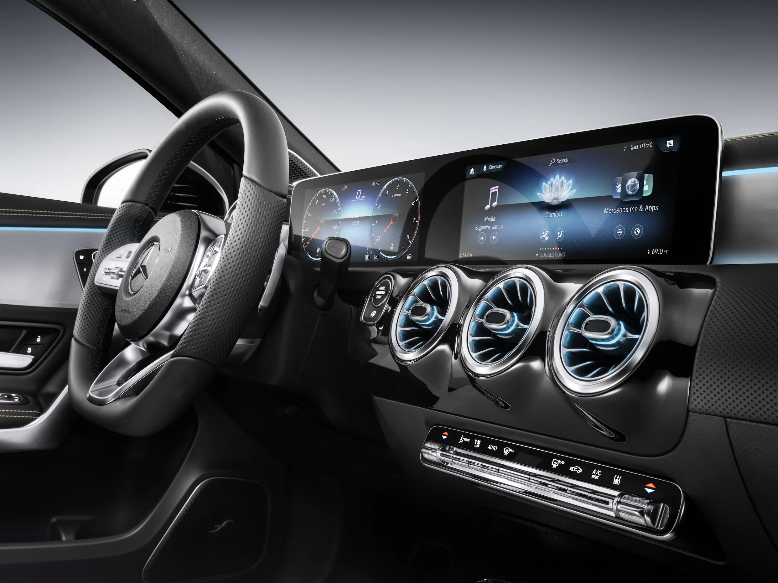
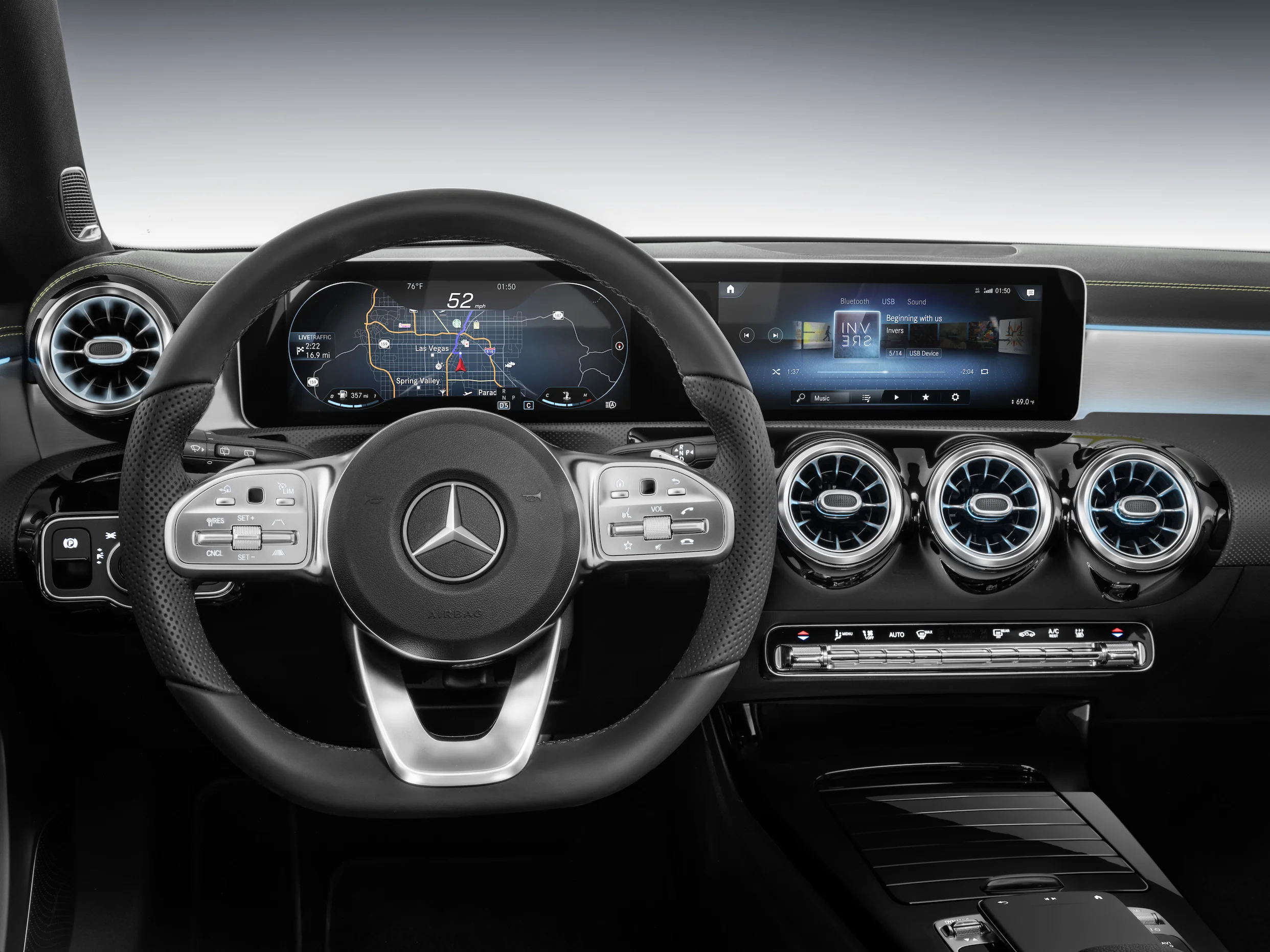
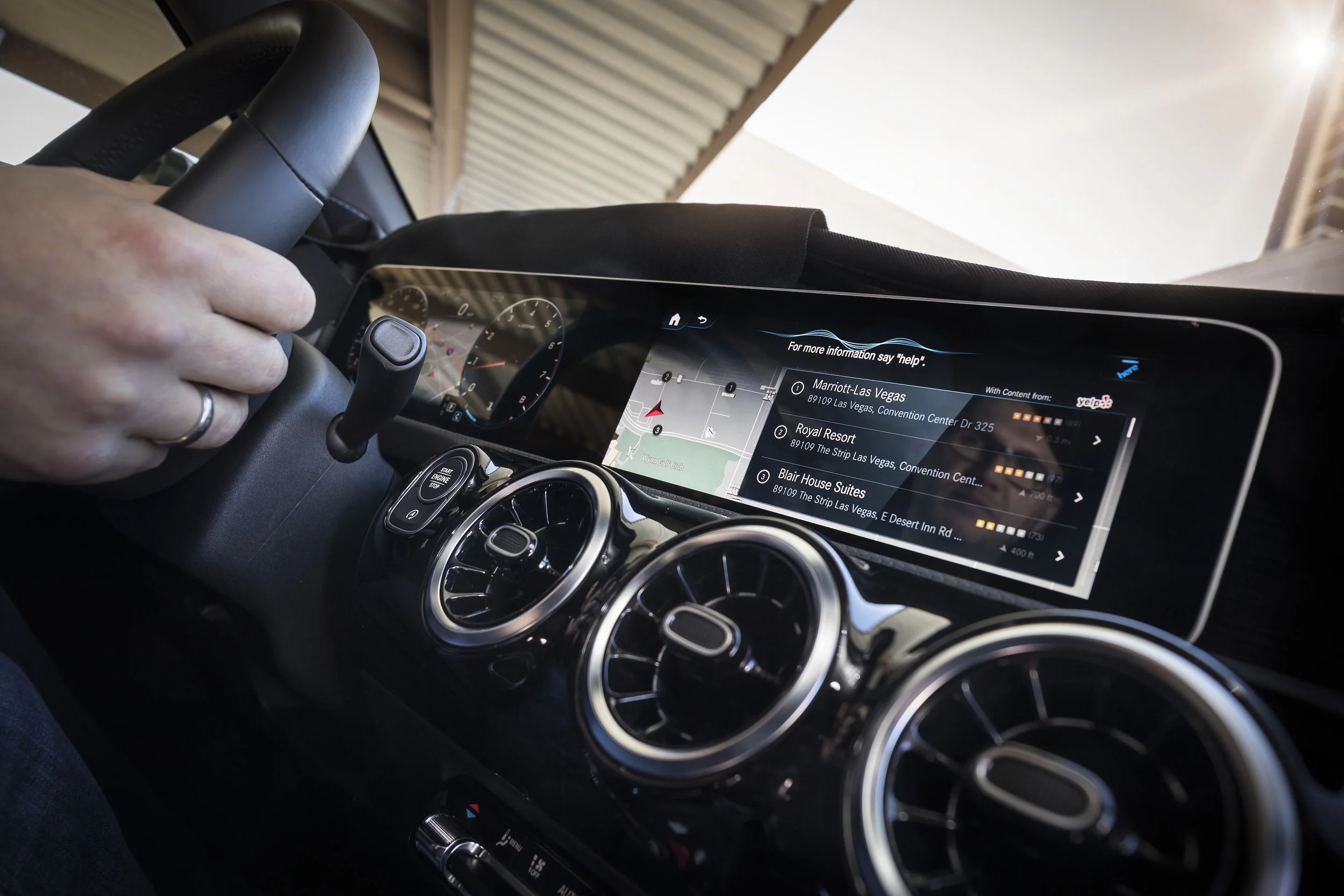
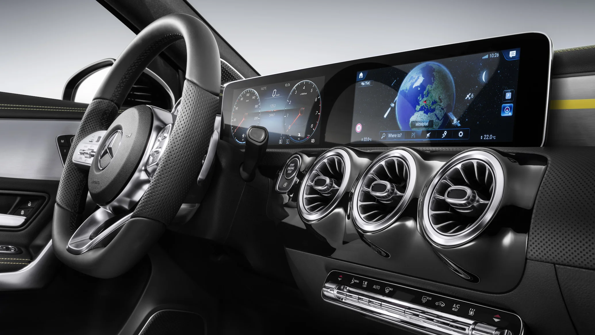
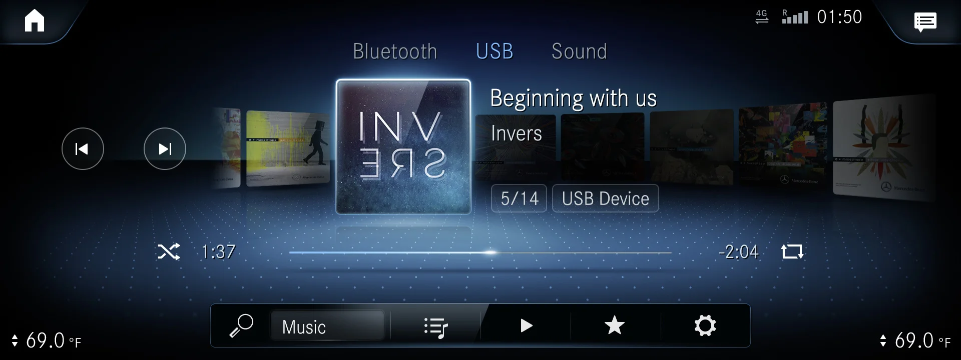
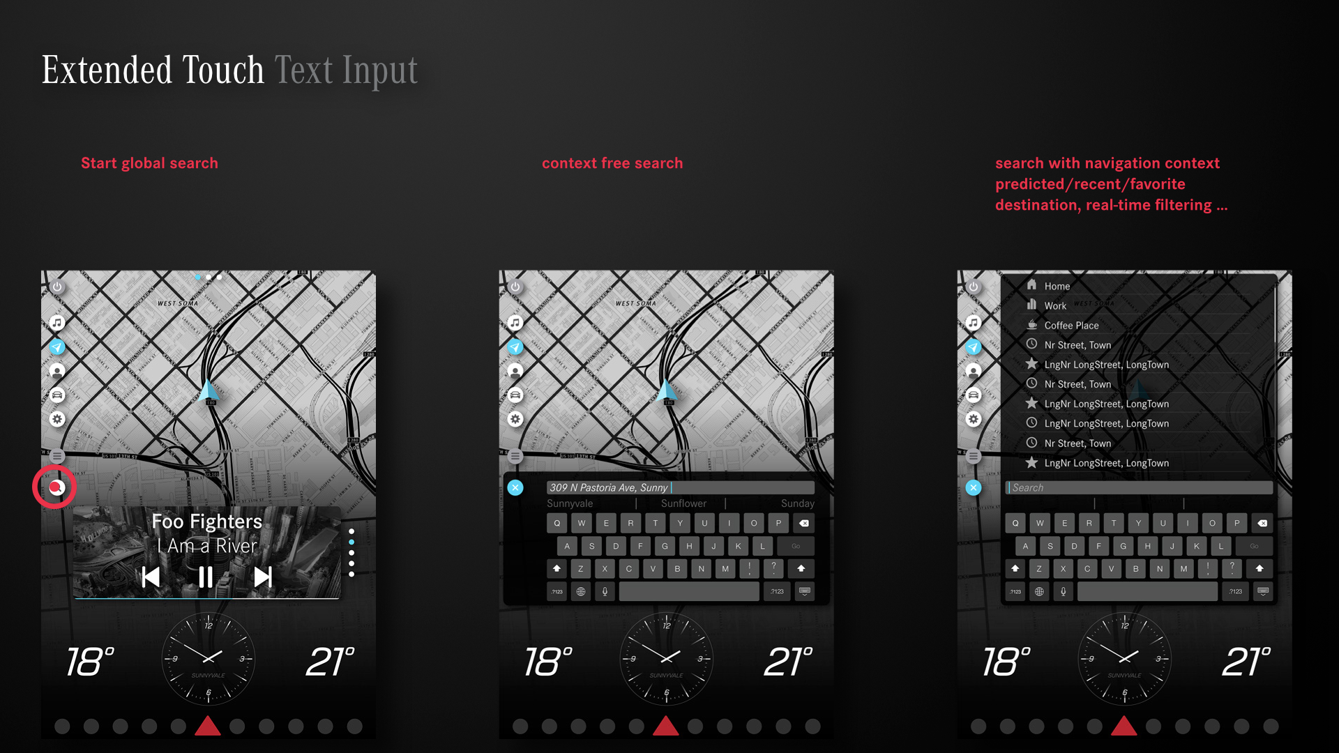
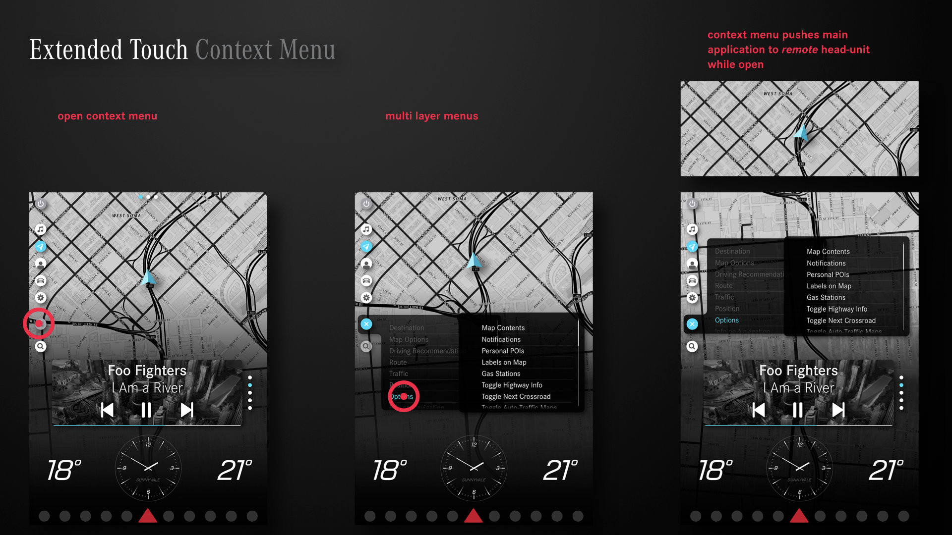
The original concept had to be adapted due to the quite unique form factor and position of the 2018 touchscreen, as you can see in the image below. In addition to the touchscreen the user can use small touch areas on the steering wheel, the larger touchpad in the center or voice to control the system. Therefore, we had to create a system that works equally well for all input modalities.
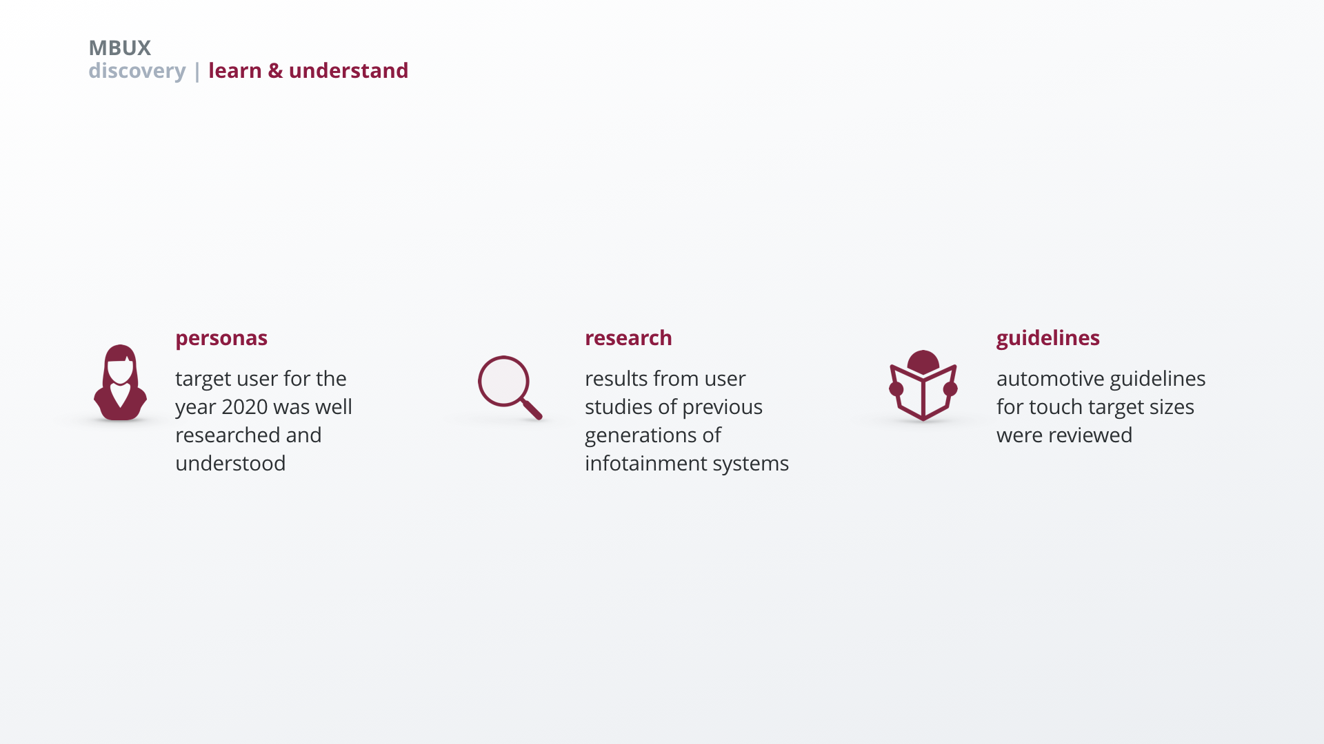
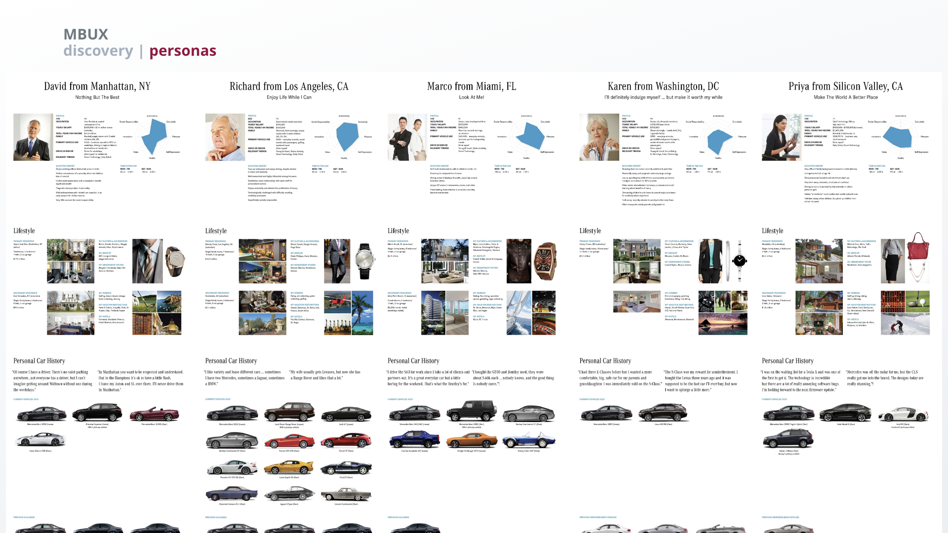
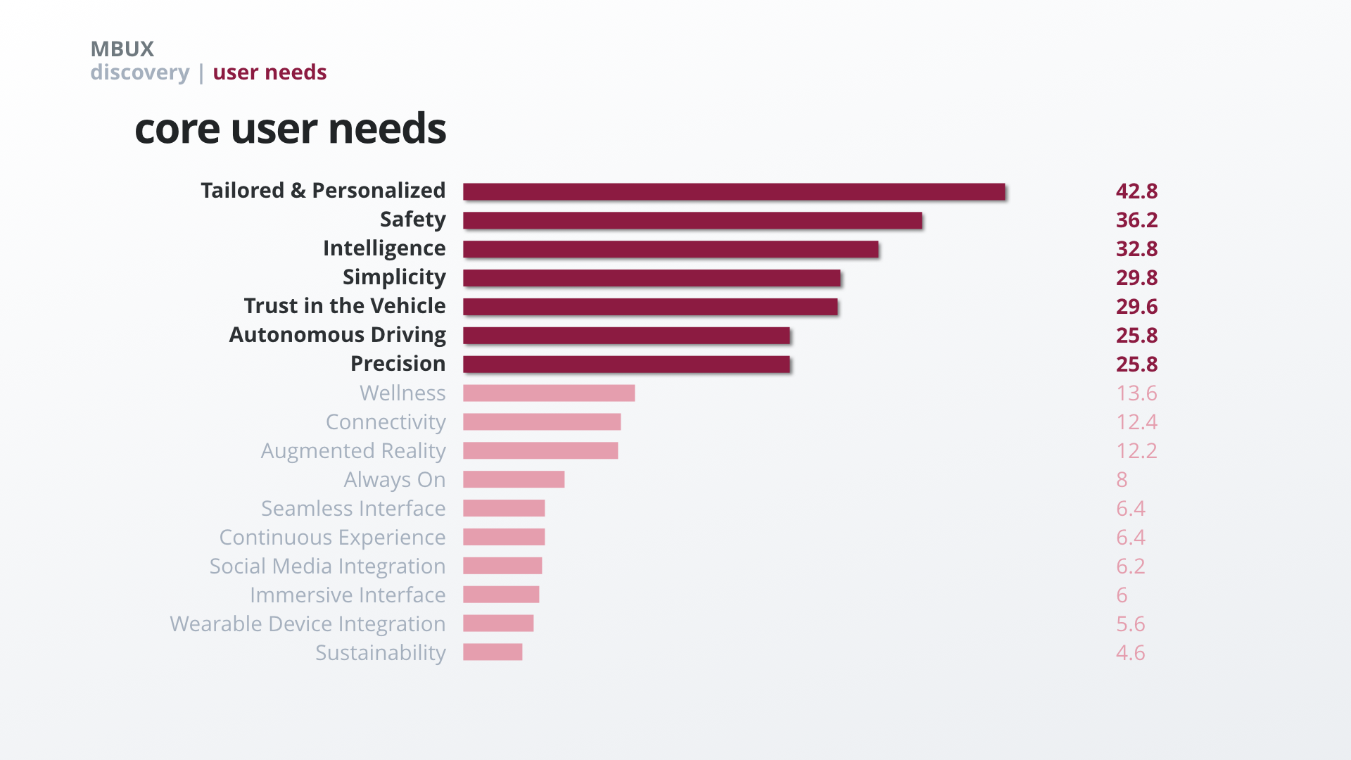
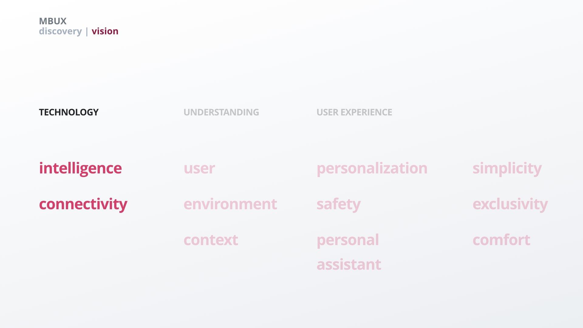
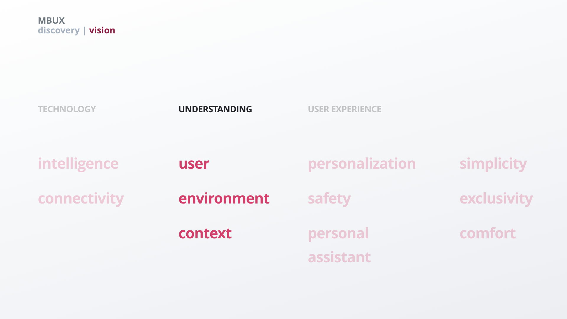
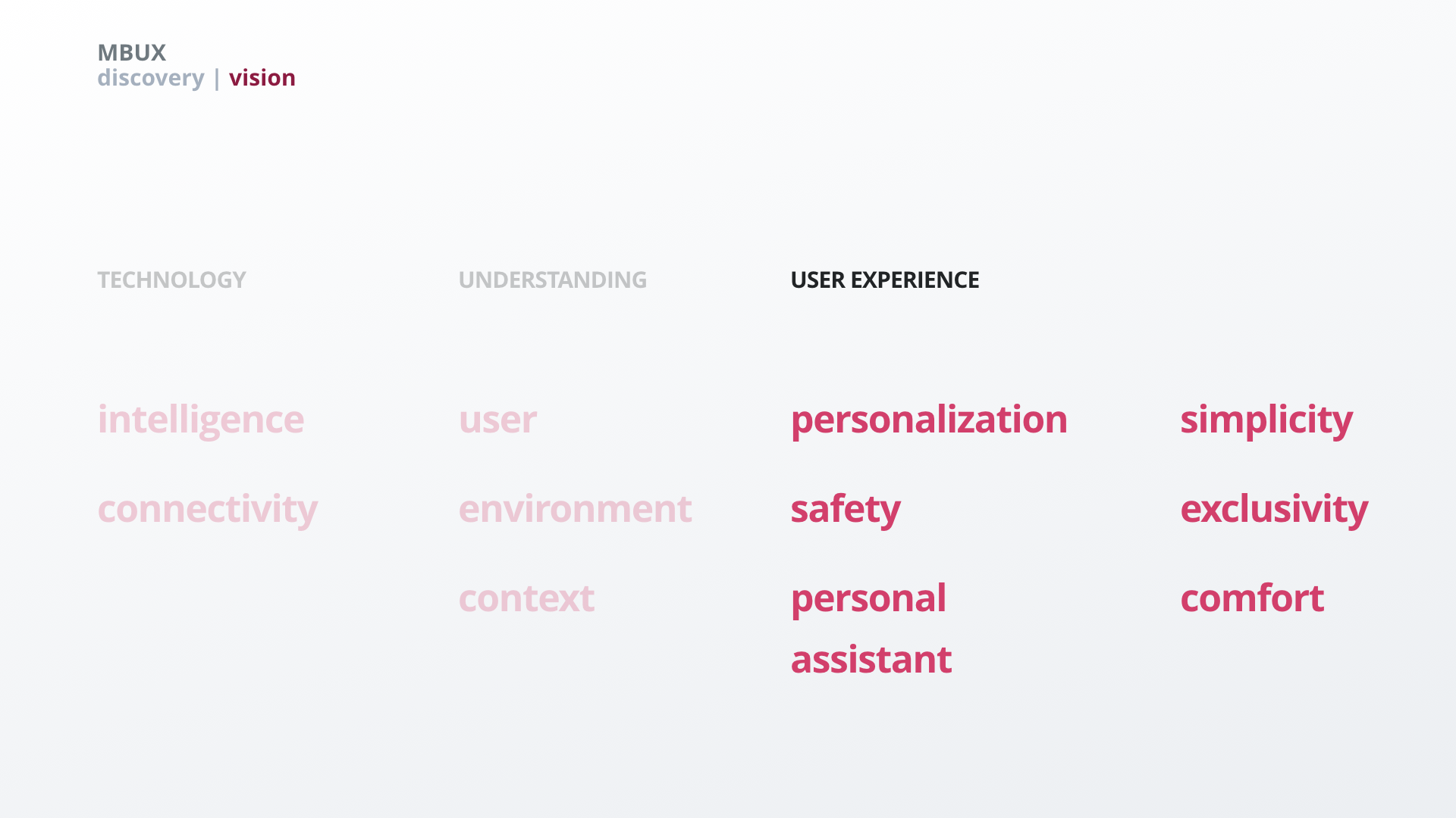
Discovery
Research & Vision
We translated the needs of our personas and relevant trends into a vision for our future digital in-car system.
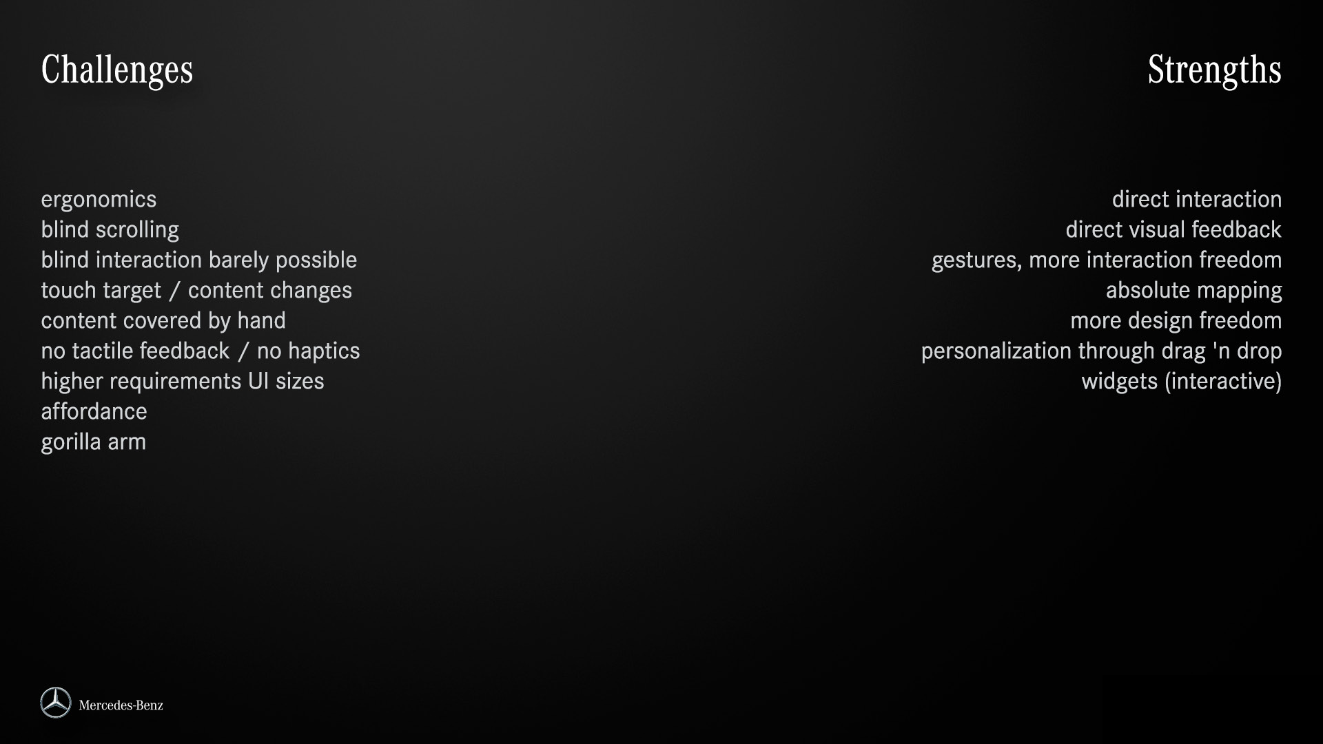
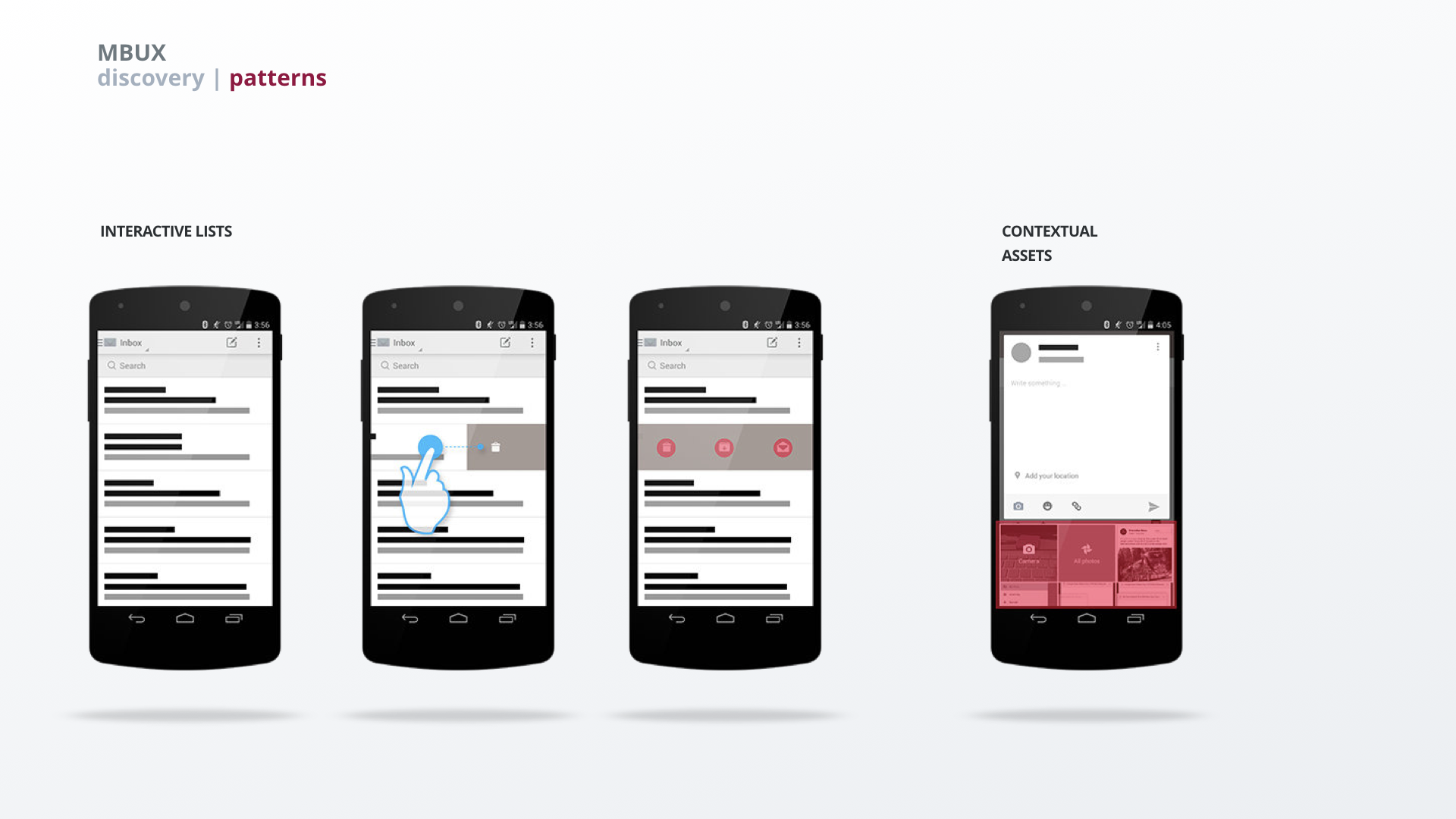
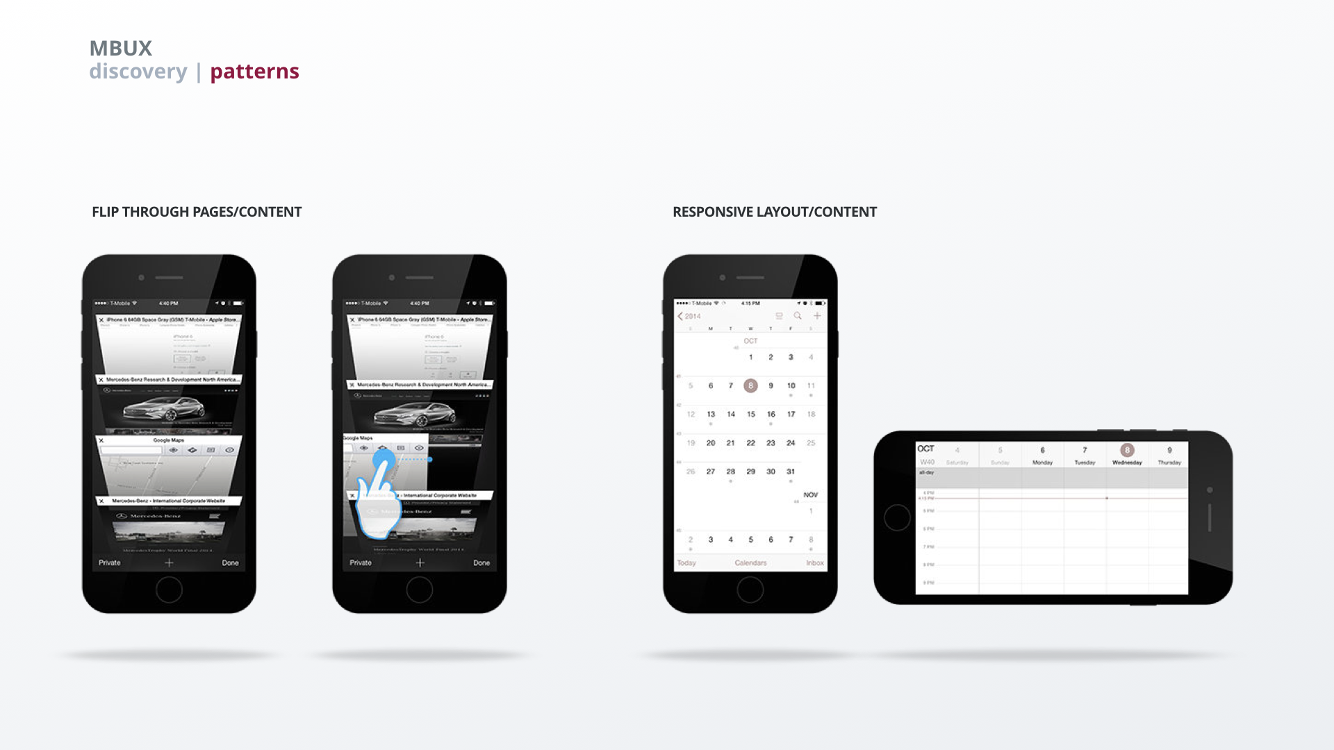
Touchscreen – challenges, strengths & benefitting interactions
It was important for us to understand the shortcomings as well as the strengths of a touchscreen in a car environment as these are quite different from handheld devices. Understanding the strengths and challenges we were able to identify which car-related interaction would be able to benefit from a touchscreen input.
About mental models
People build mental models based on experience – which is where most conceptual models for in-car systems fail their users. Users usually have to get used to either a different way of interacting with the system than they are used to from their phones (rotary control vs. touch screen) or the interaction patterns are vastly different from what people are used to.
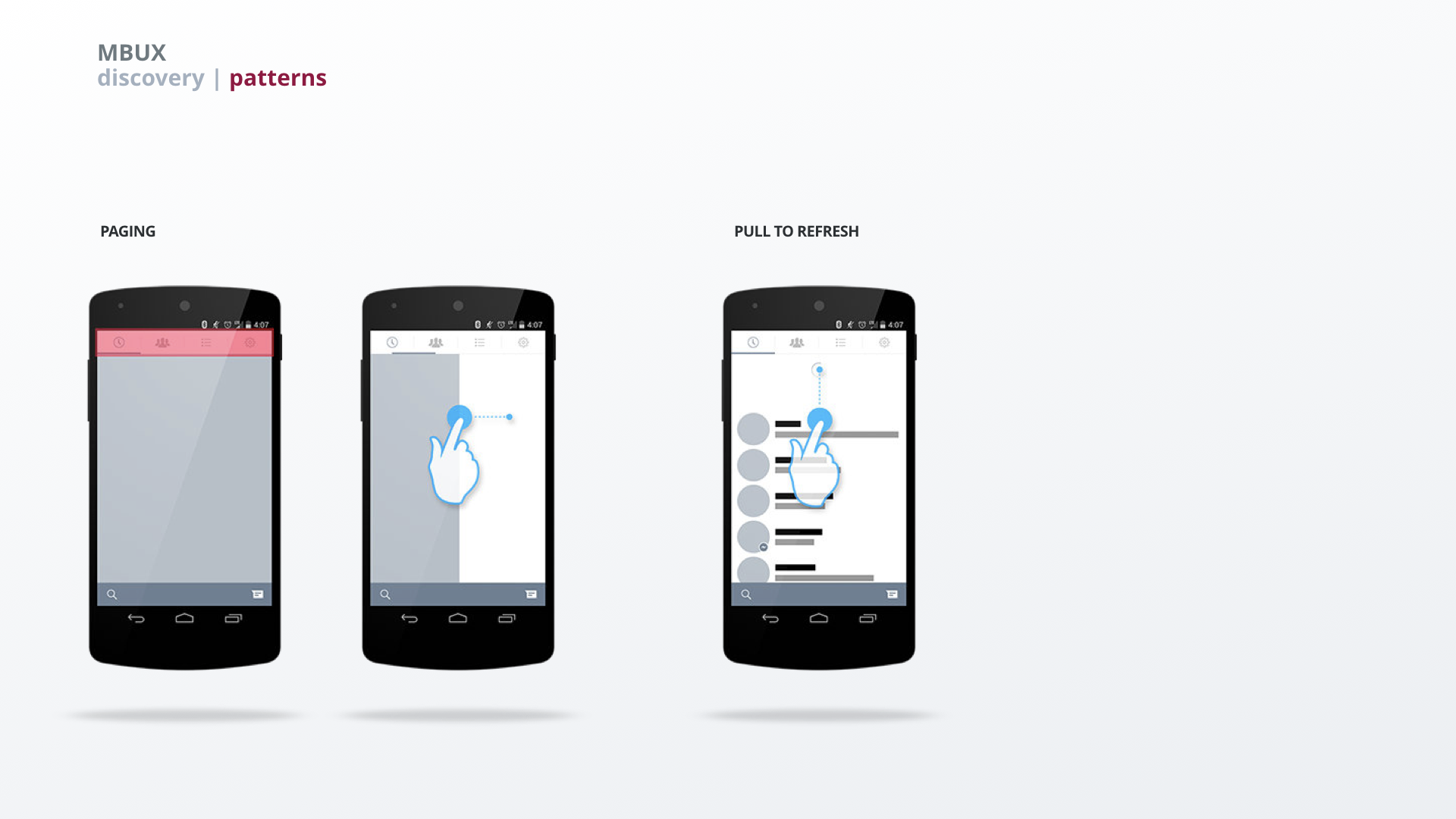
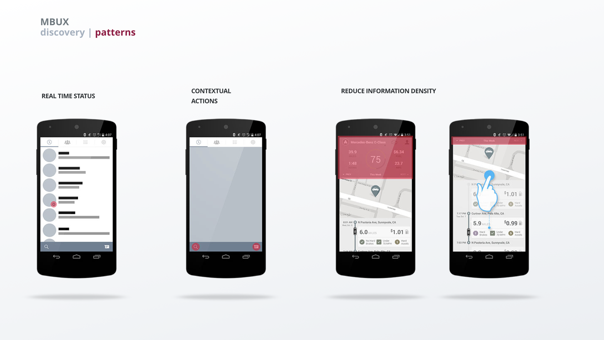
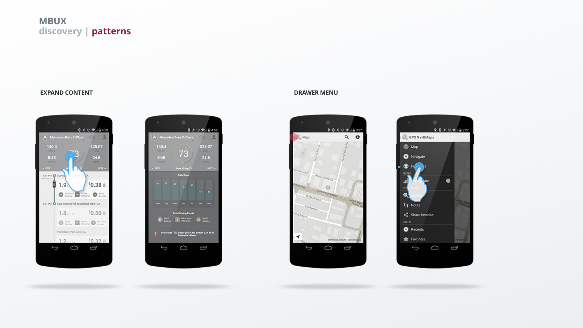
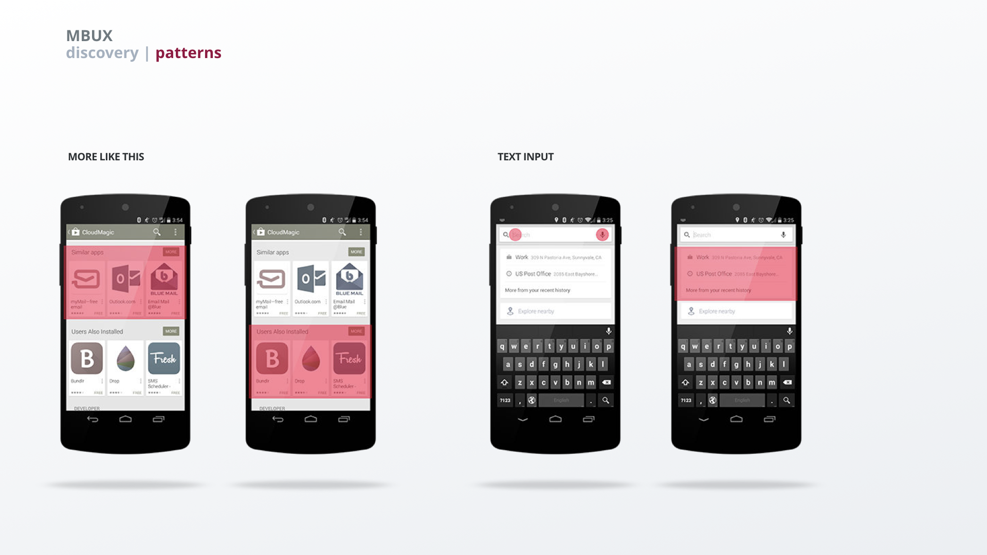
That's why we looked into established interaction patterns from smartphones – the touch device people use
most frequently.
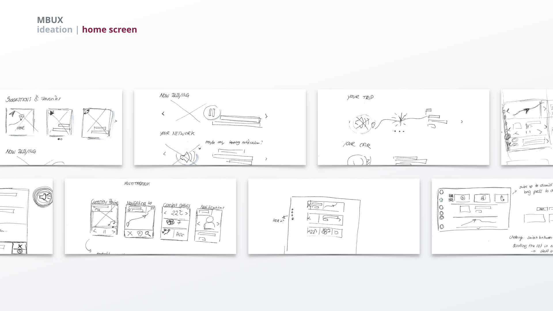
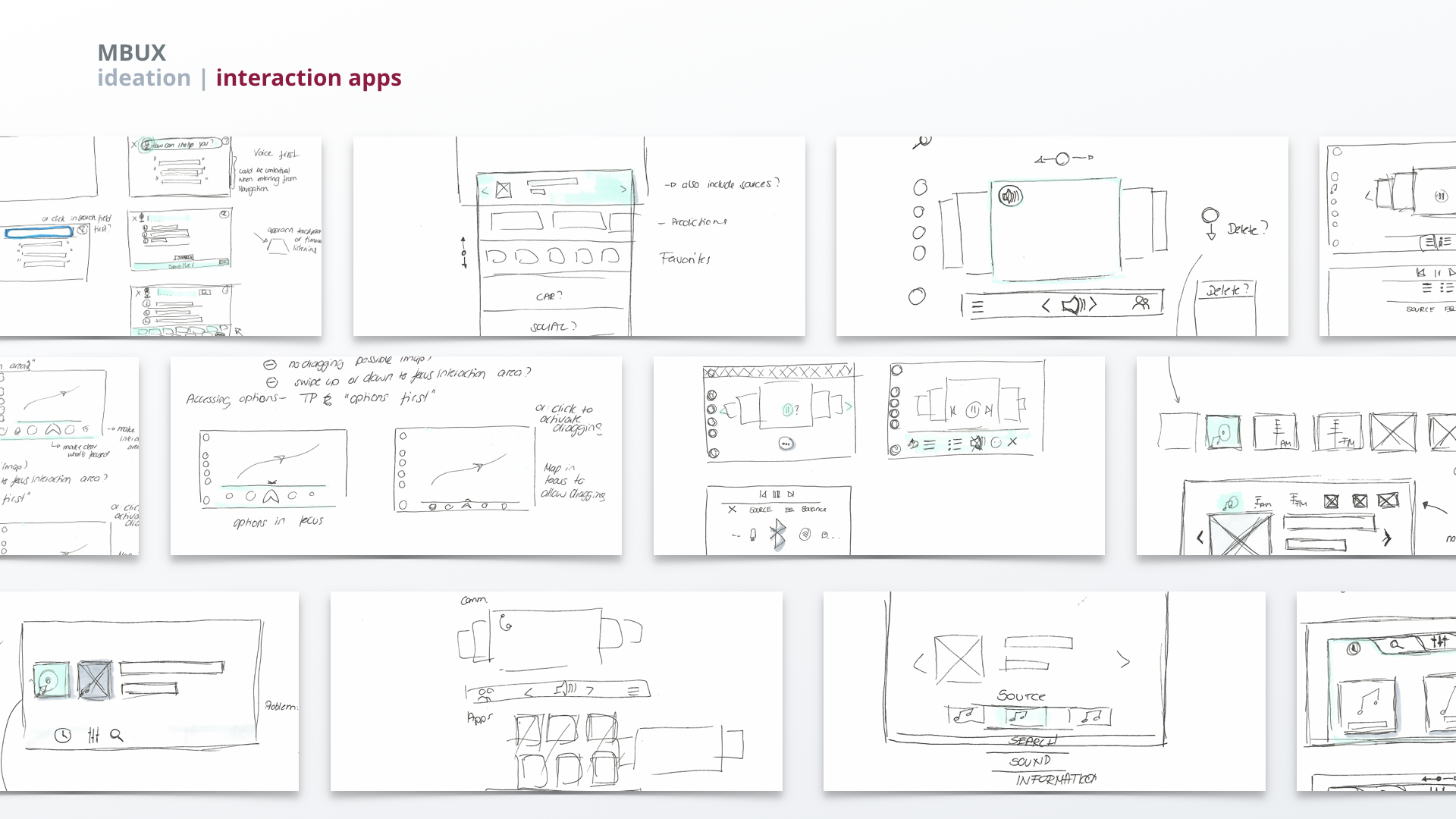
Ideation
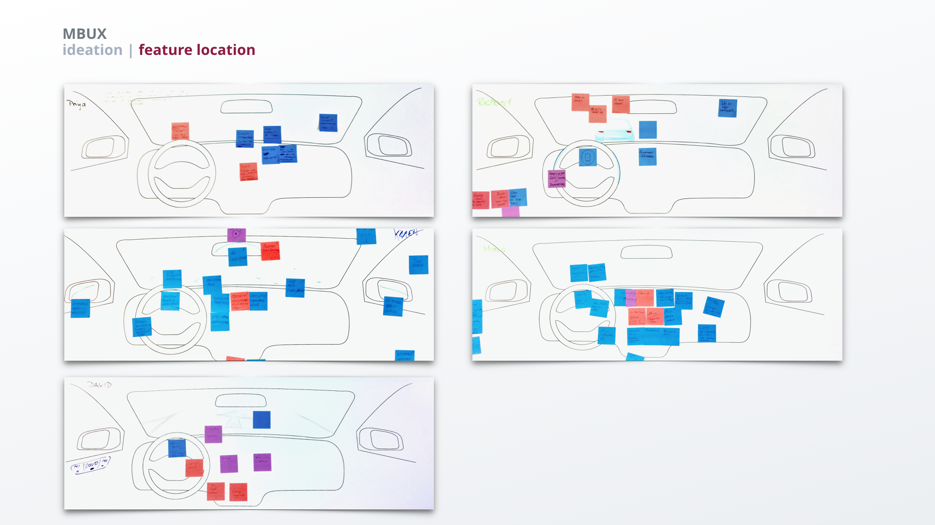
For each persona we created user stories and broke them down to the feature level. We then defined where (or on what screen) those features should be living. Furthermore, paper-pencil sketches were used for ideation throughout the process starting off with the general framework and narrowing it down to in-app interactions and layout.
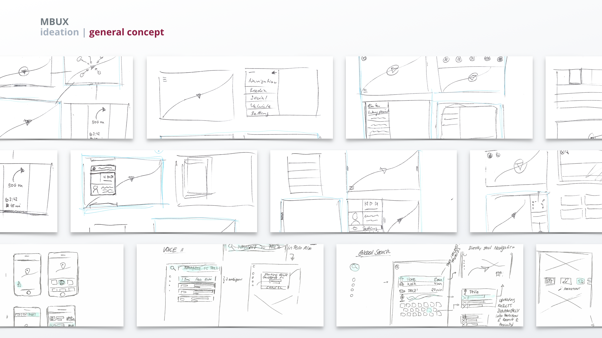
Concept Variations
We prioritized different ideas for the general system structure based on insights from our personas and best practices, and ended up with three different concept directions we explored further.
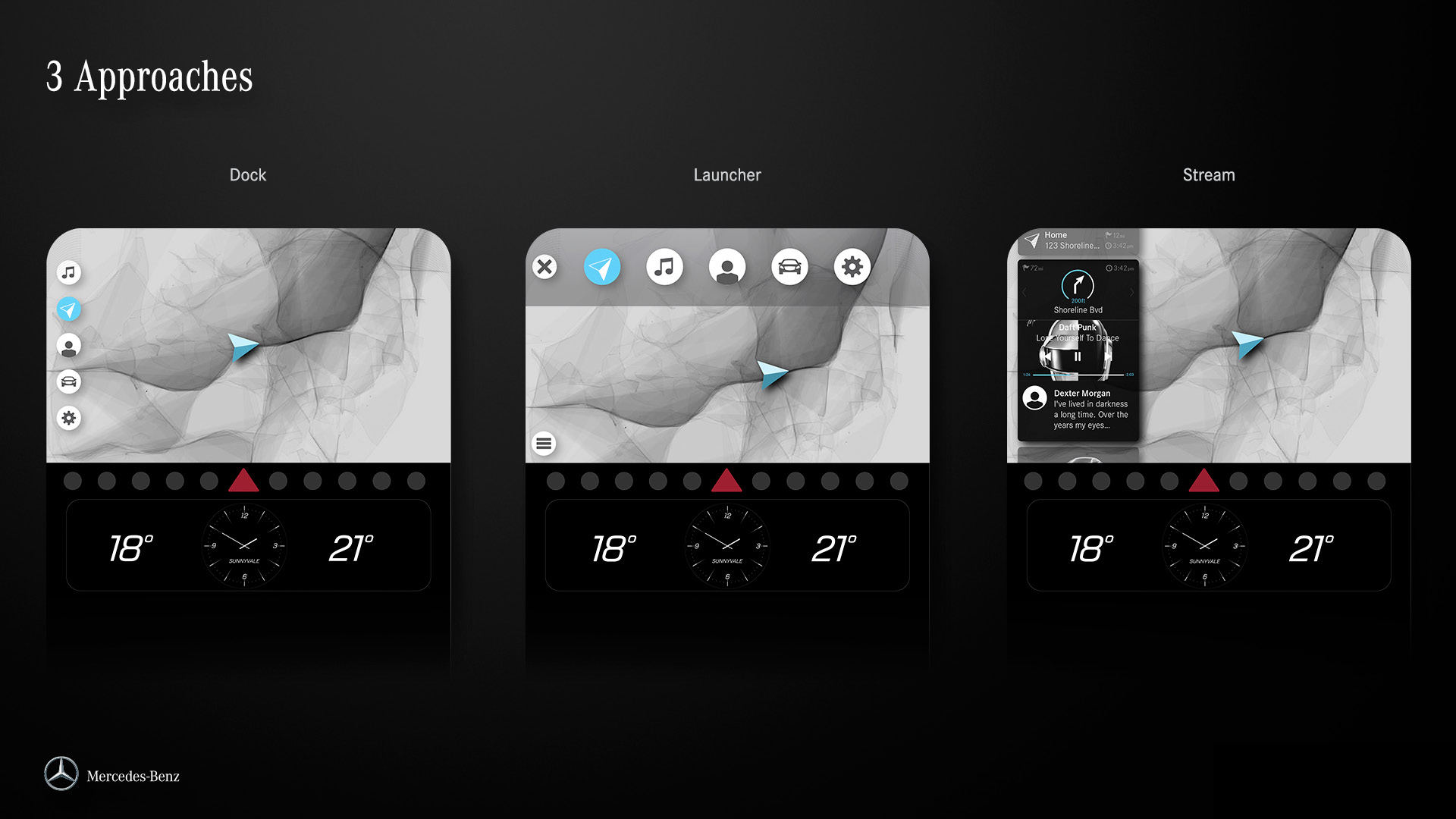
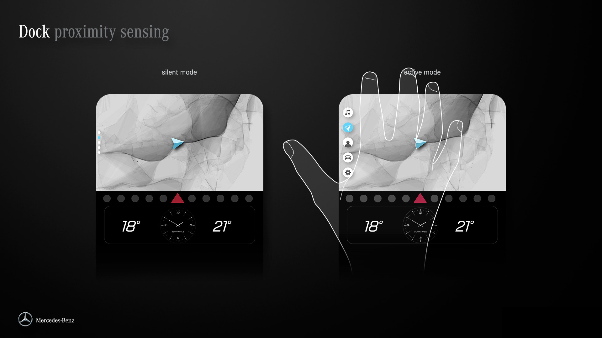
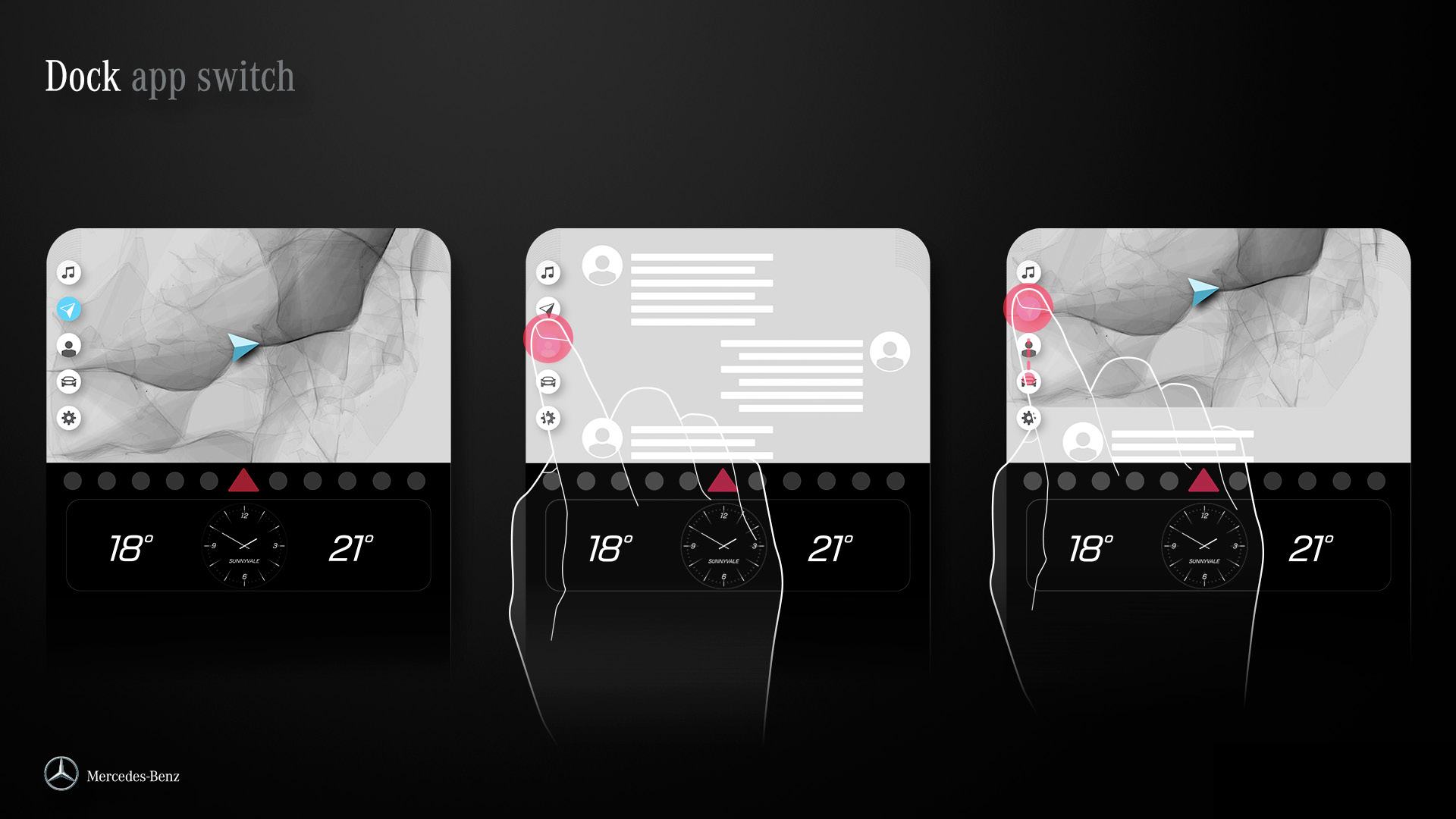
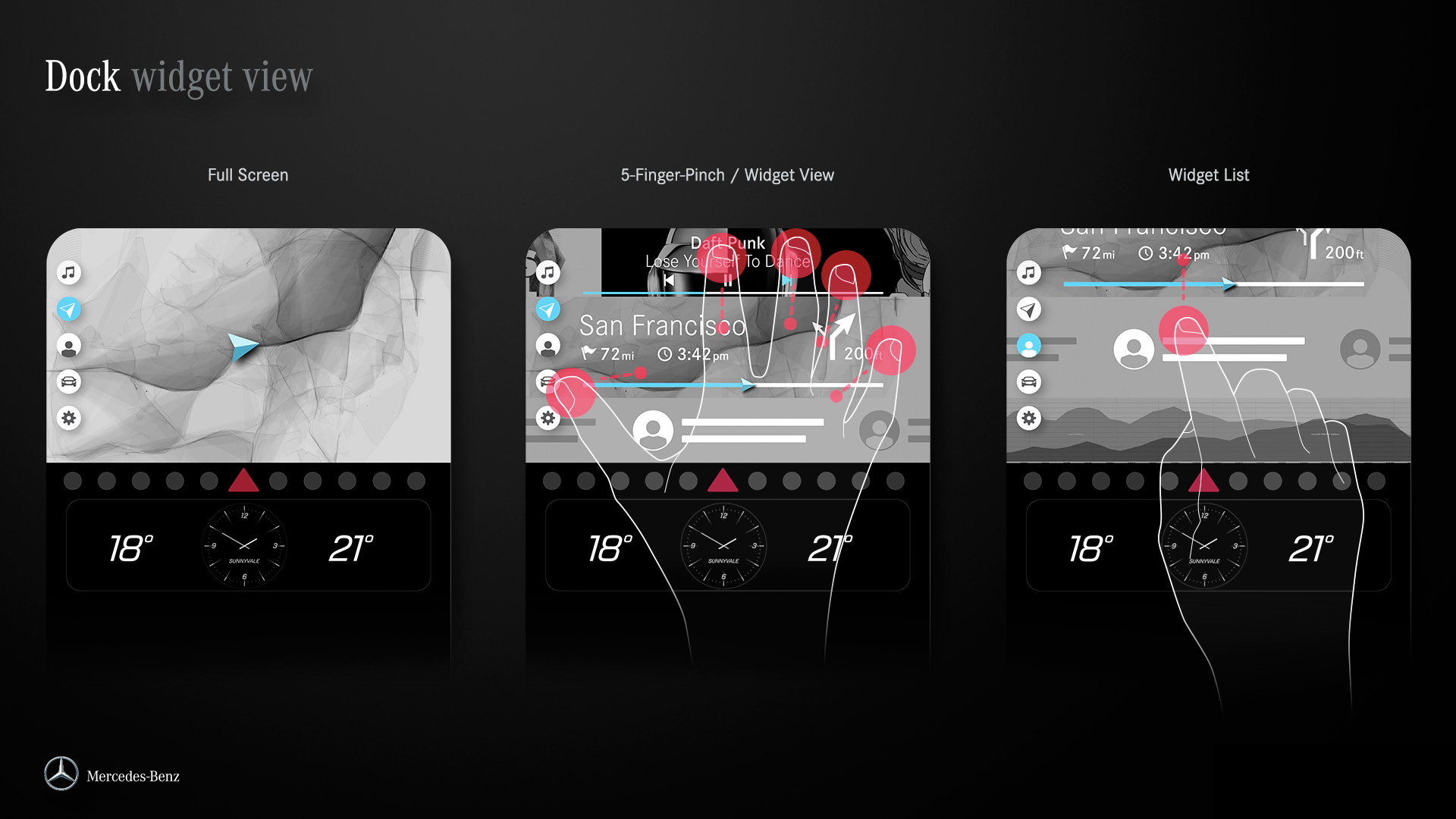
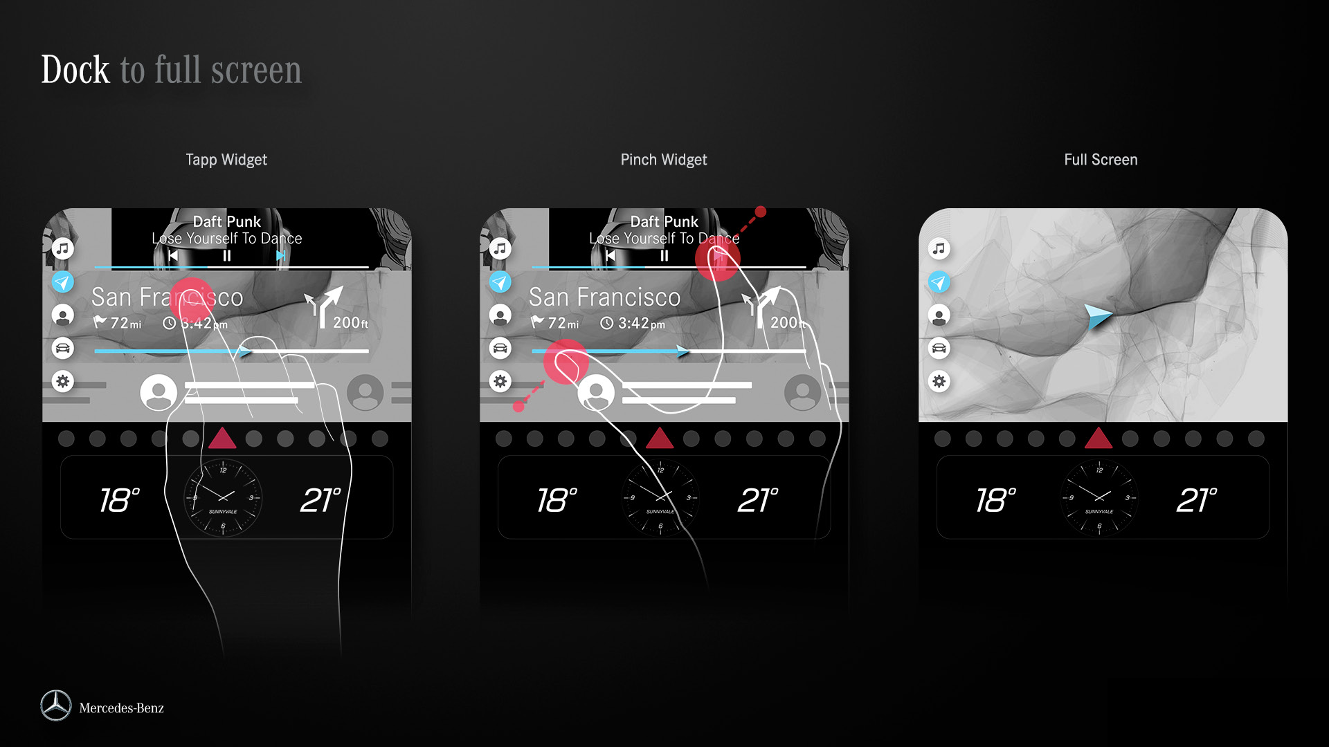
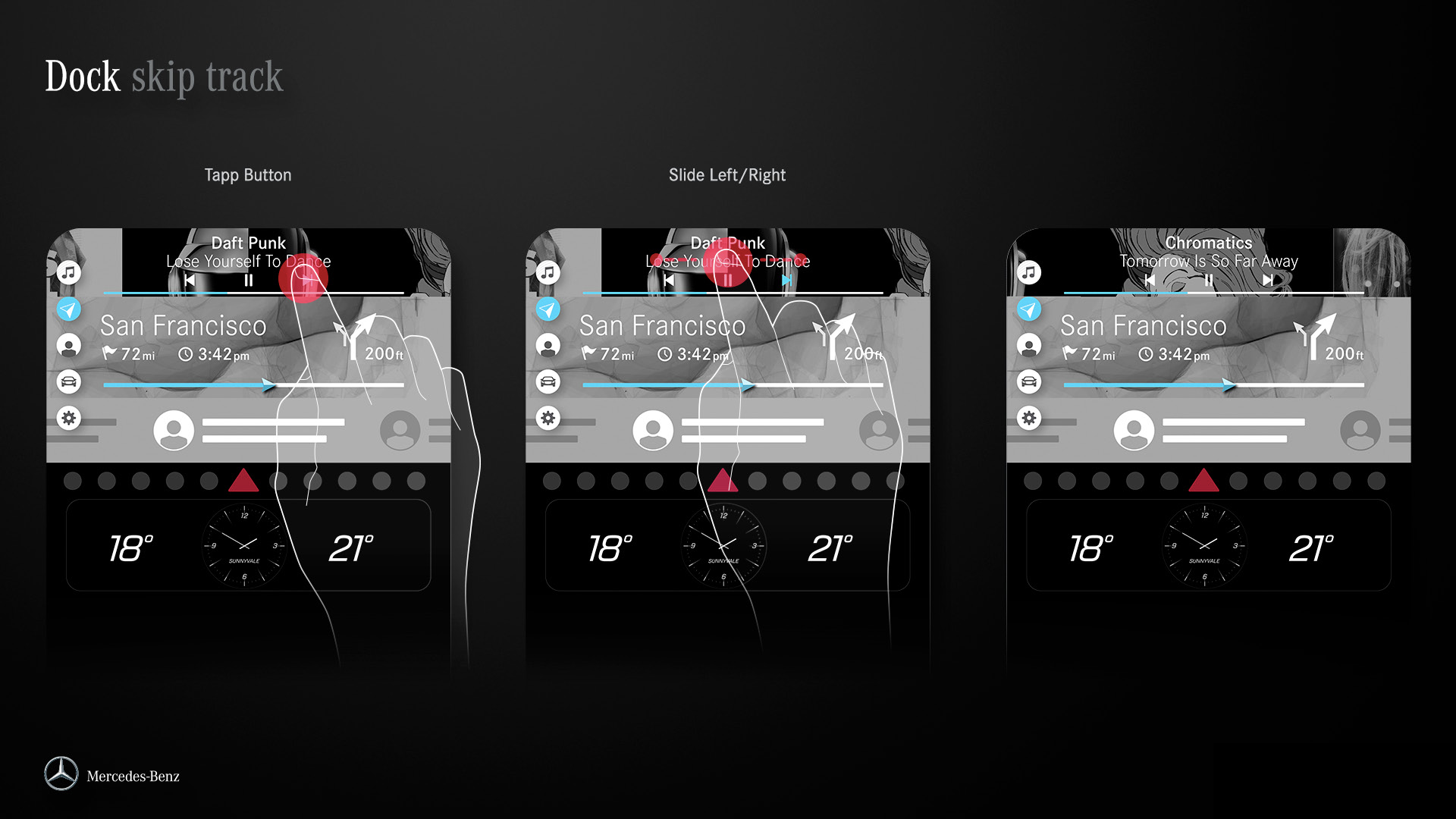
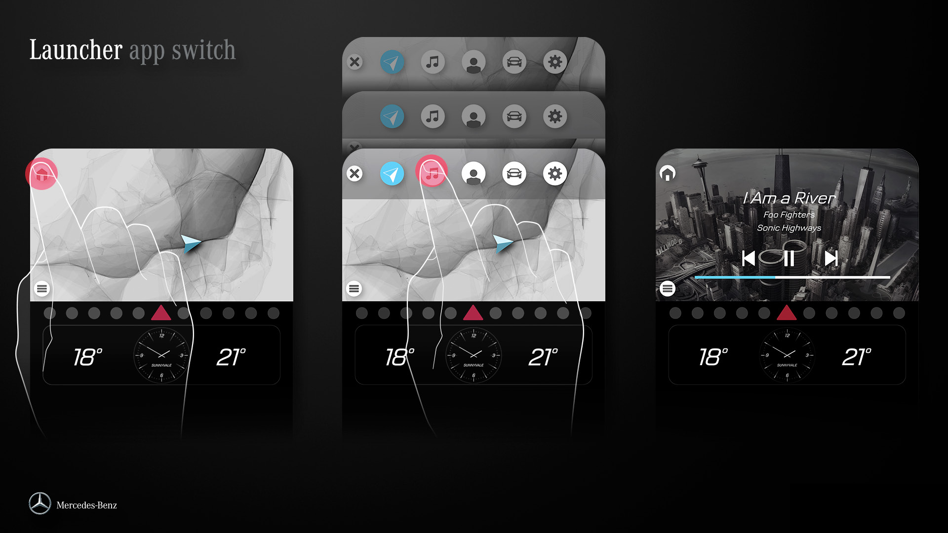
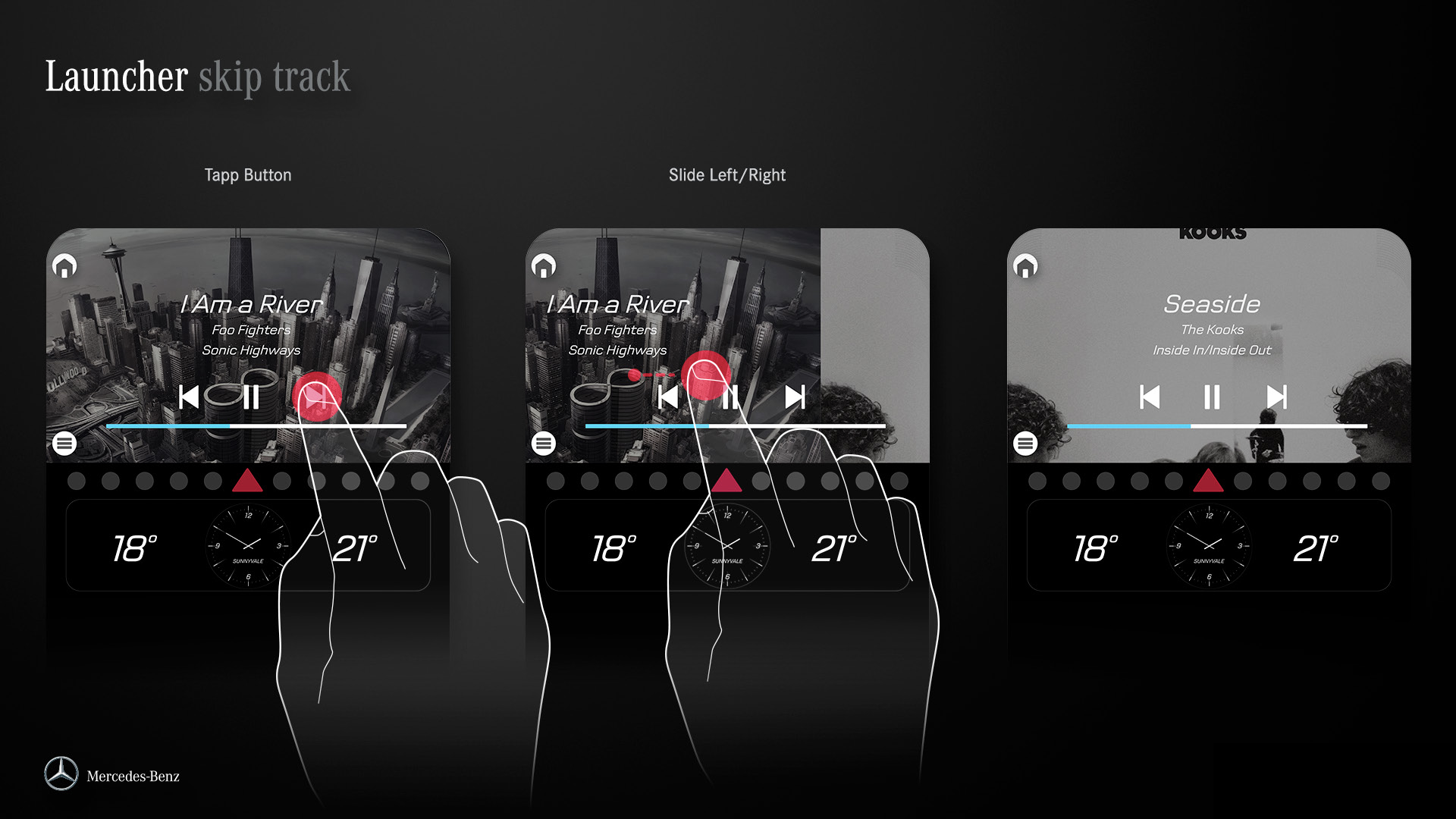
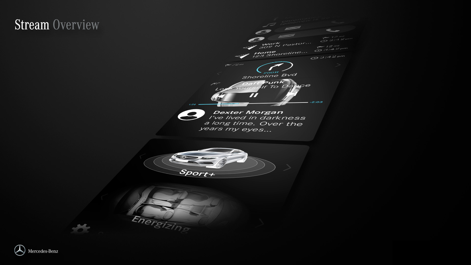
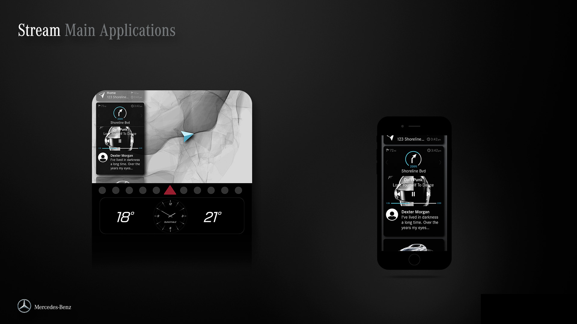
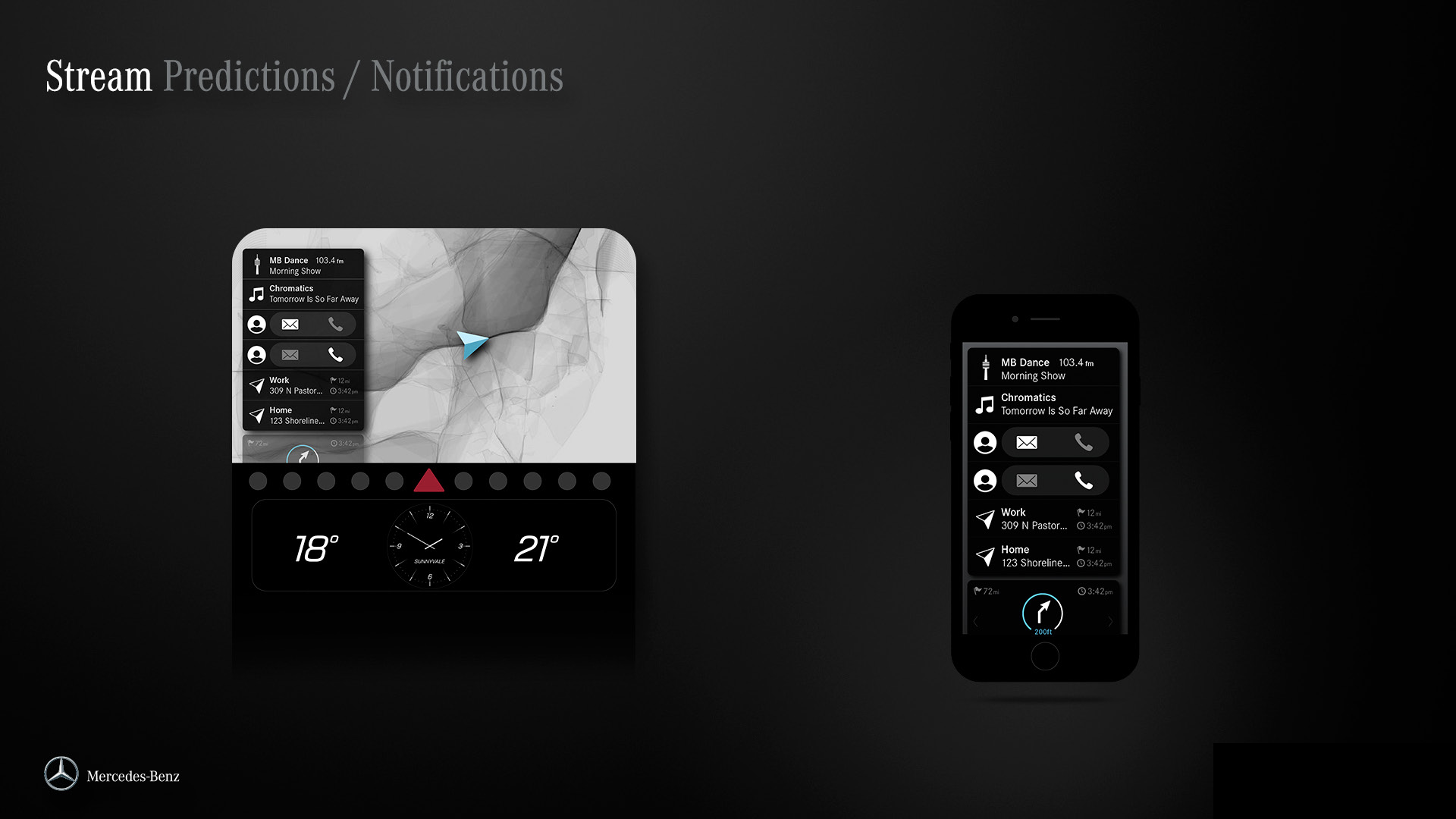
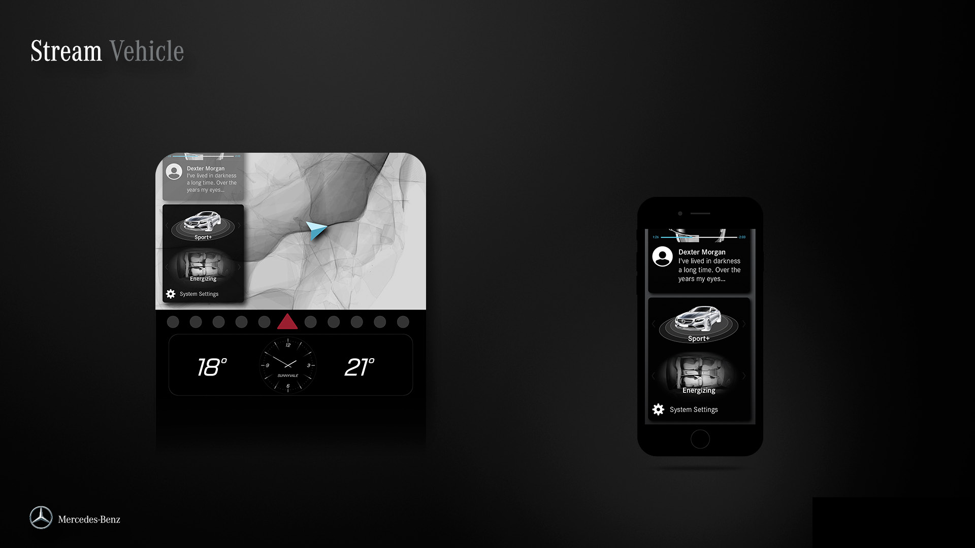
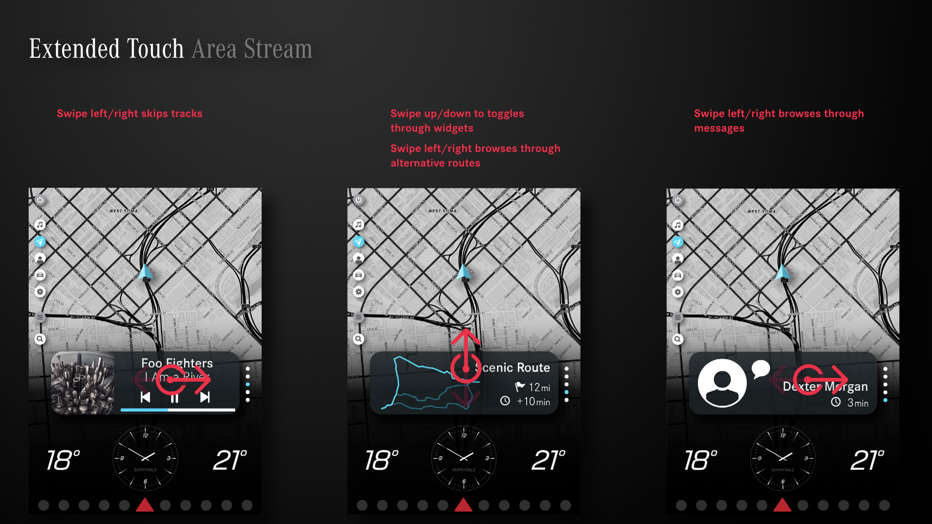
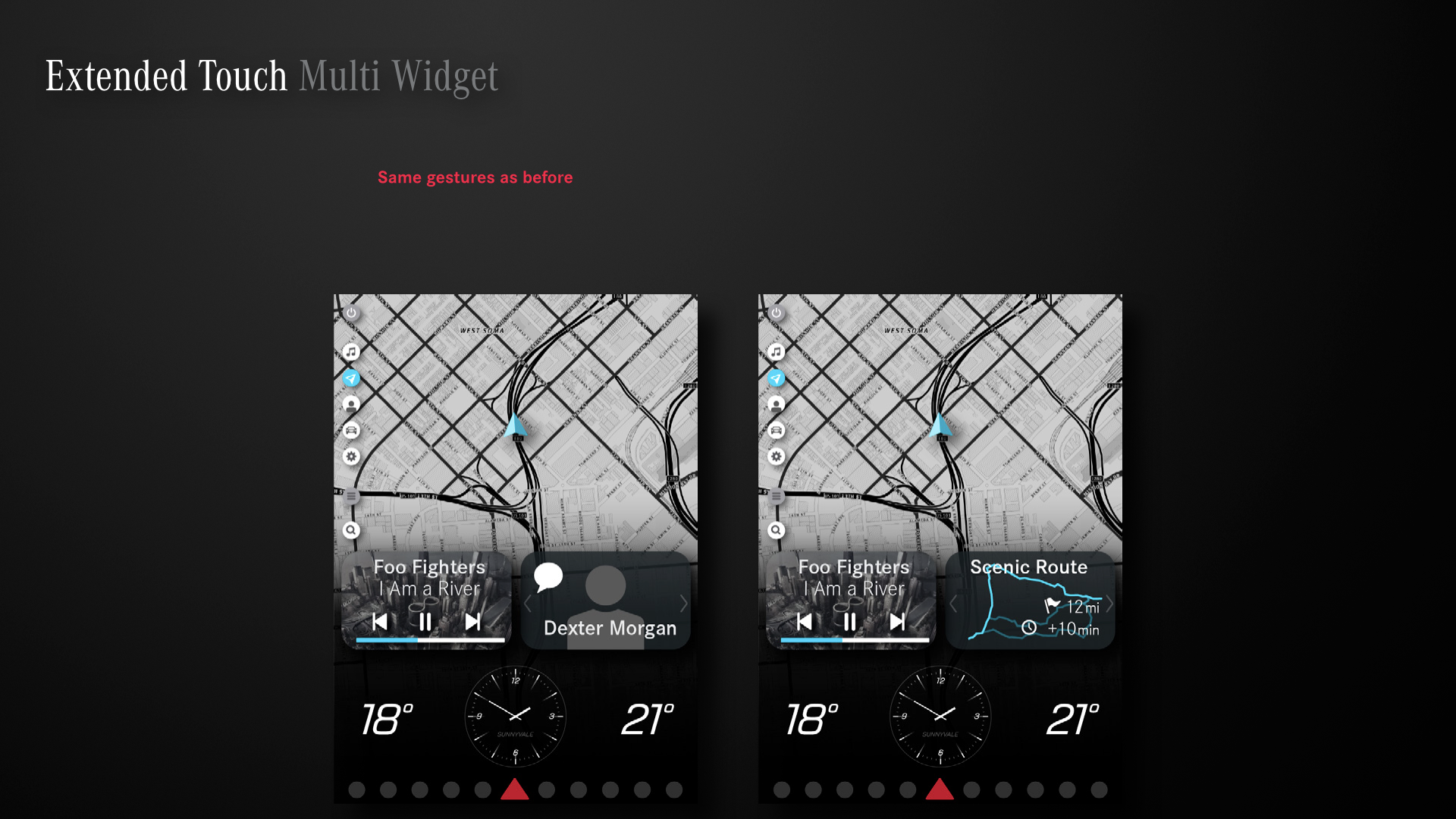
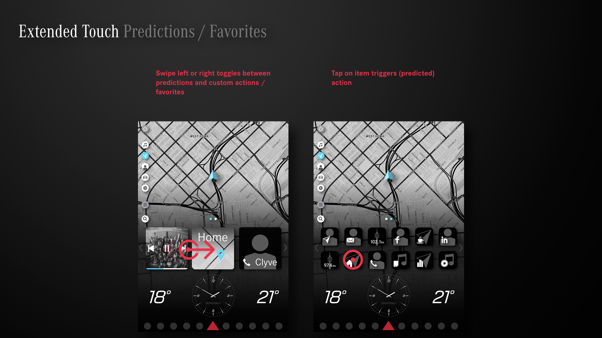
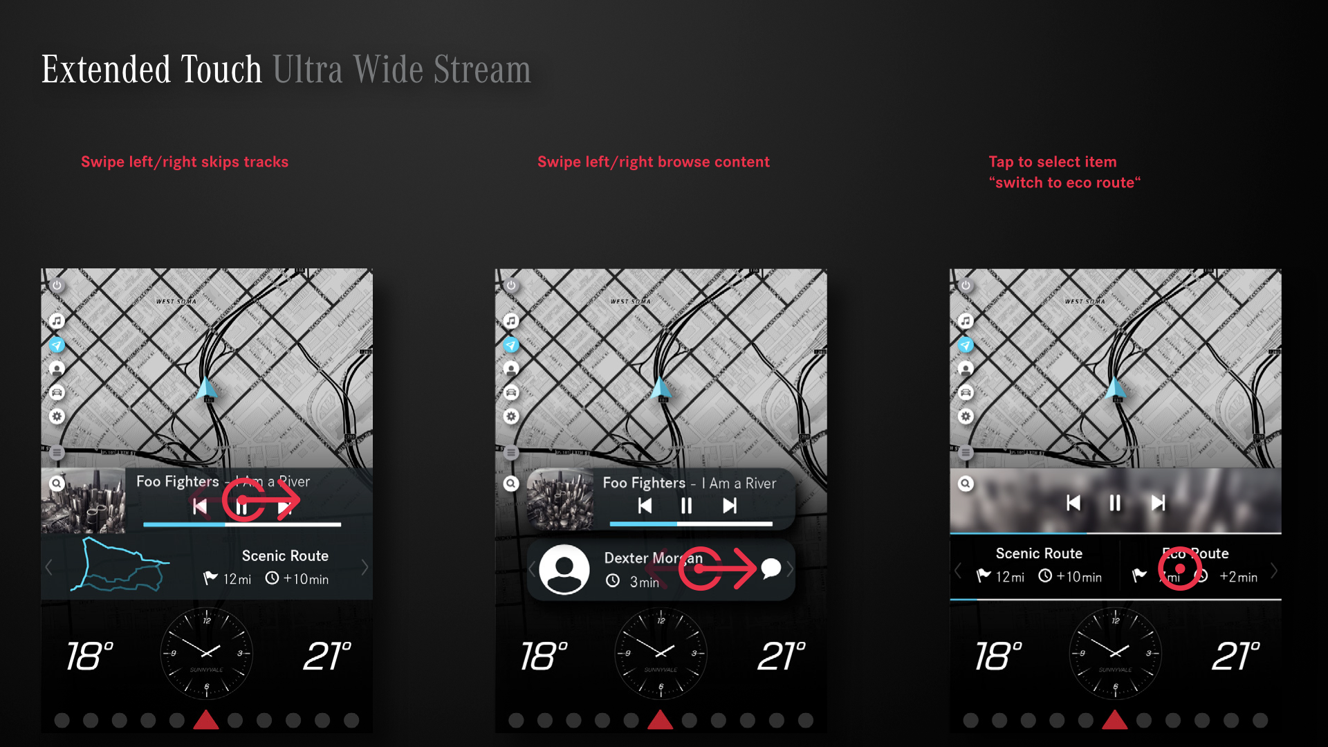

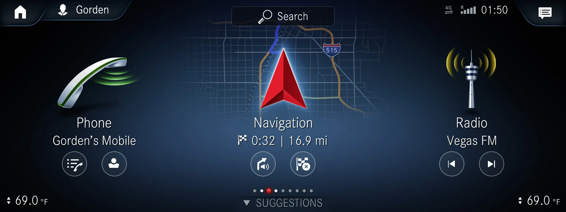
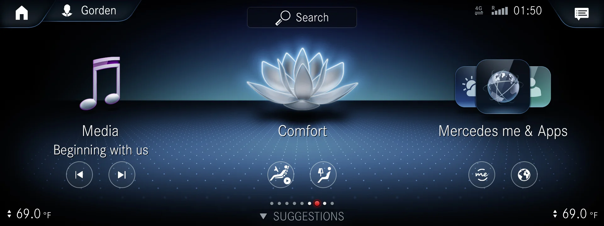
Decision Point. We evaluated strengths and shortcomings of each of the concept directions and decided to move forward with a mix of the dock and launcher concepts as we were able to use the same patterns across most of our applications and use cases. We also added the wide area stream concept to allow easy access to functions like skipping a track while having the main focus on other applications such as navigation.

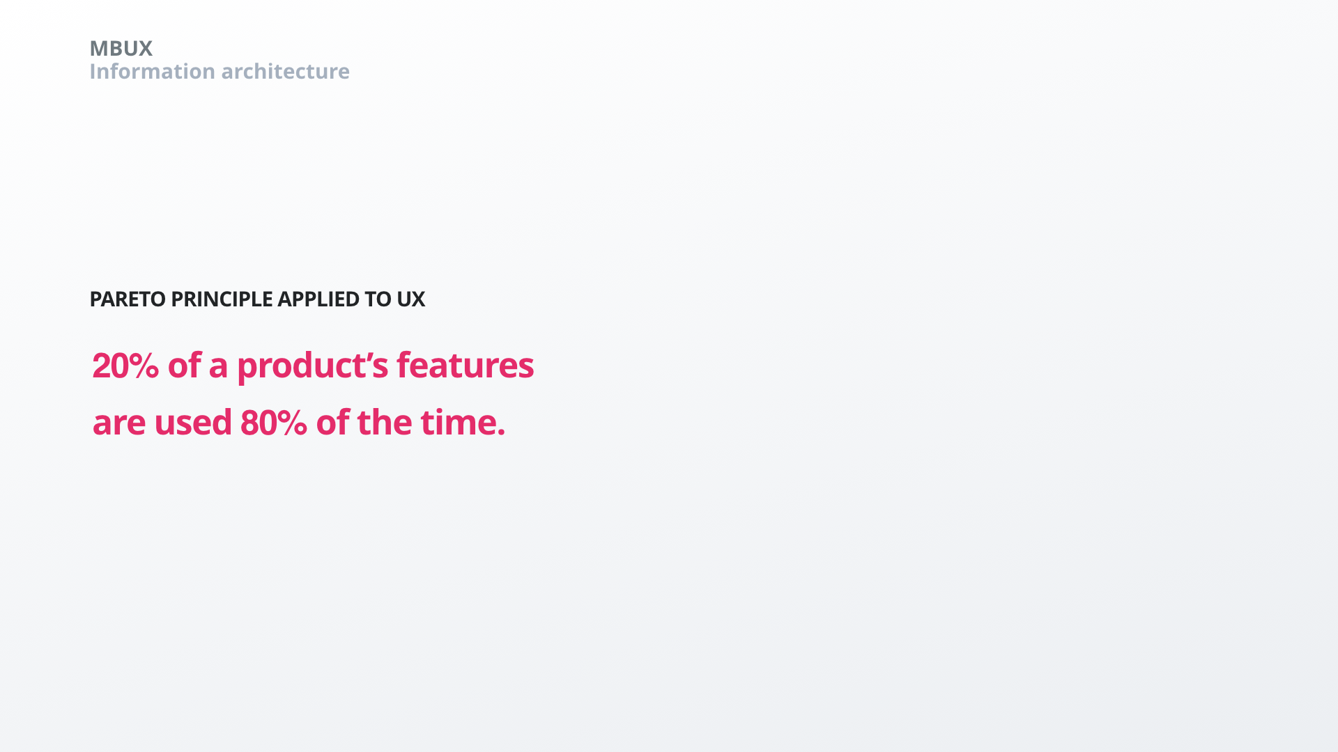
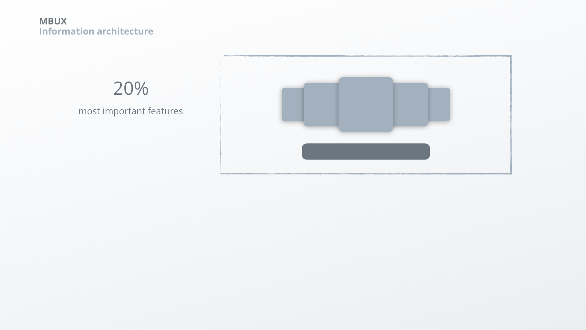
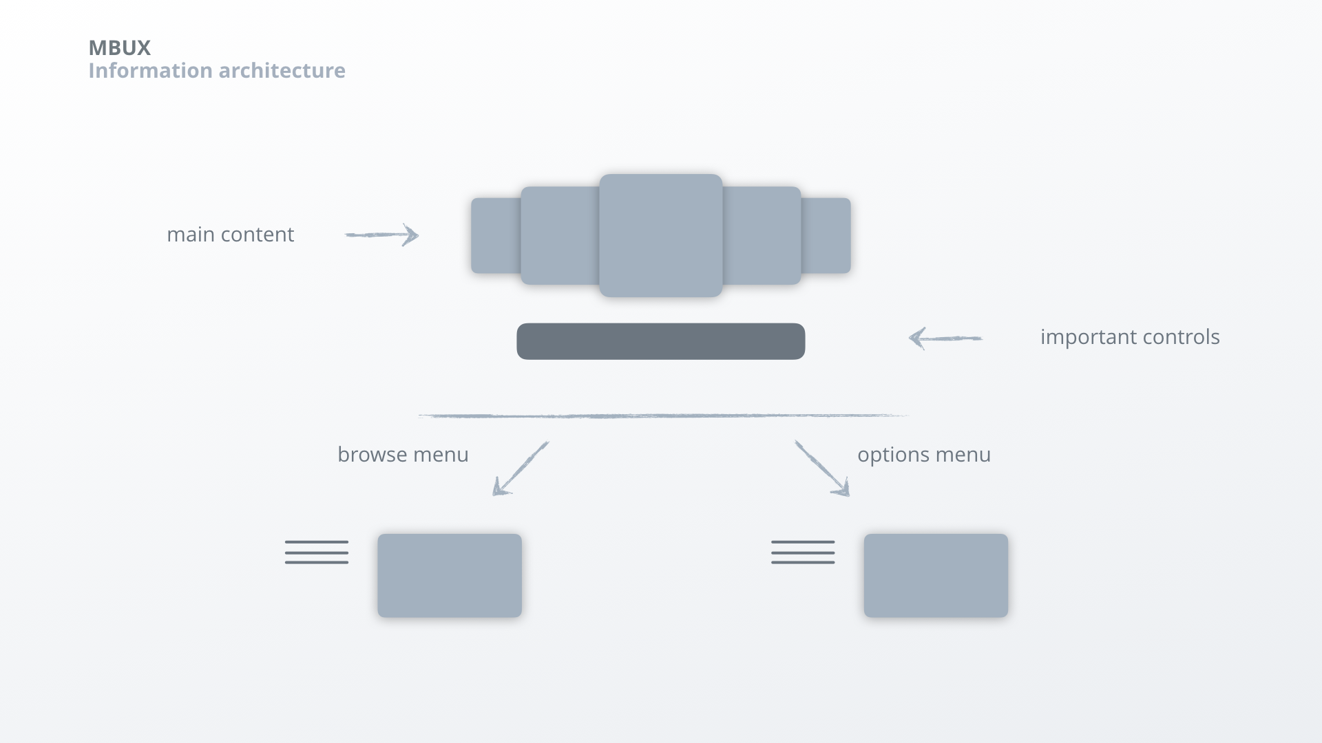
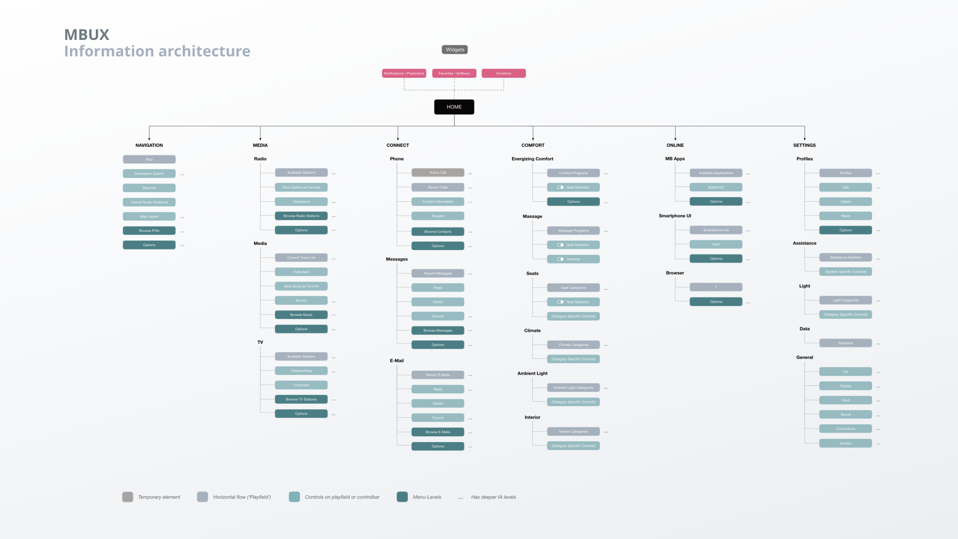
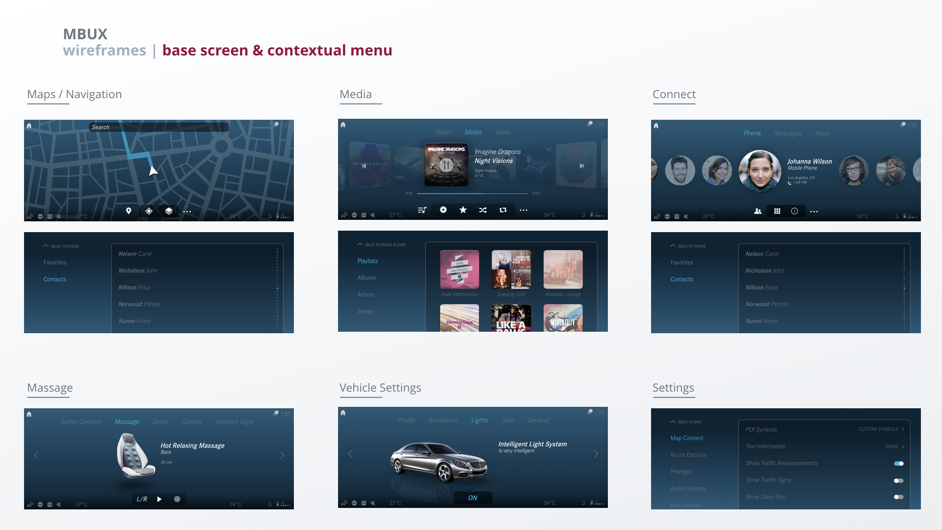
Information Architecture
We established a clear information hierarchy in order to keep the functions people use most frequently simple, easily accessible and clean.


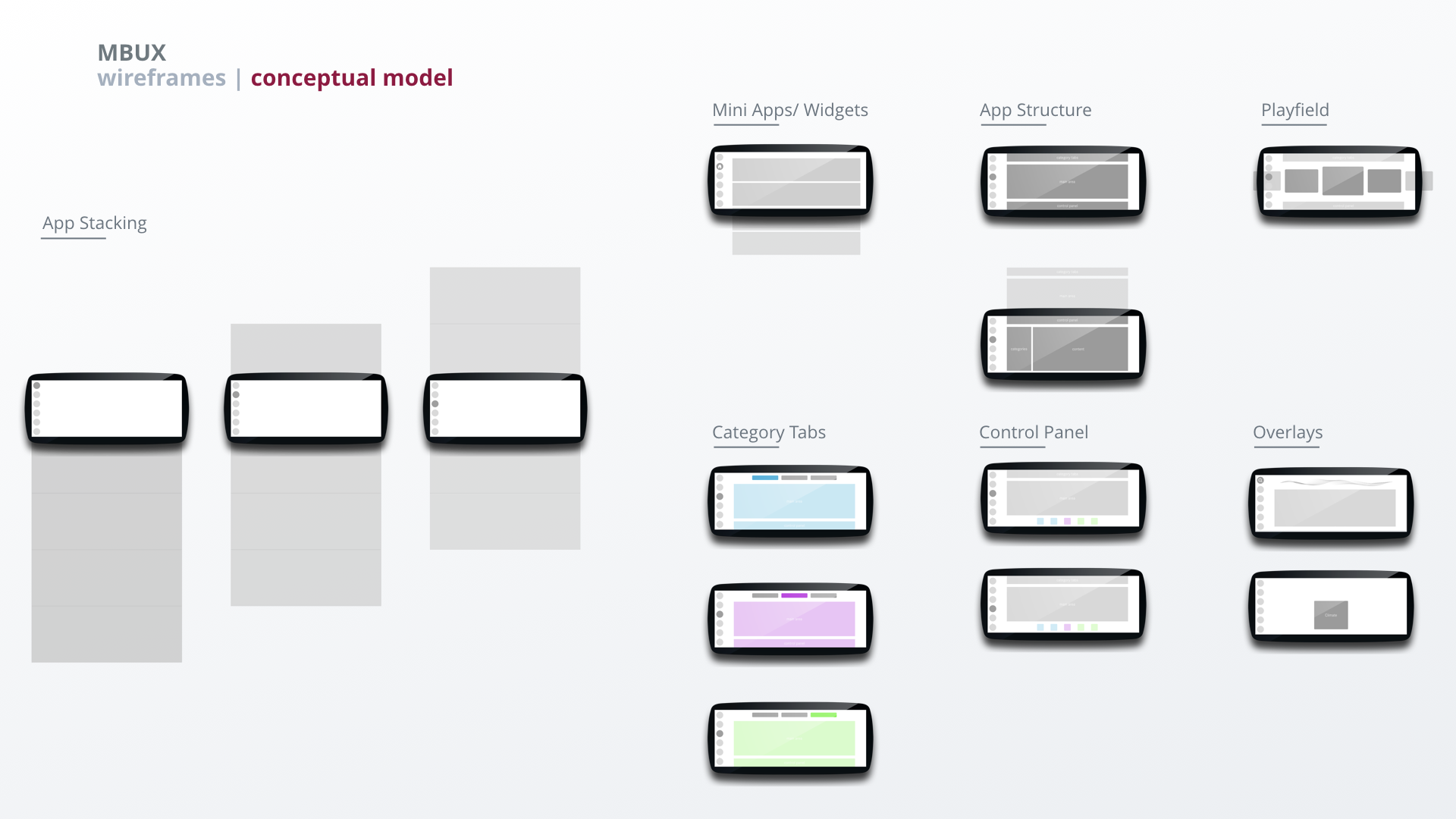
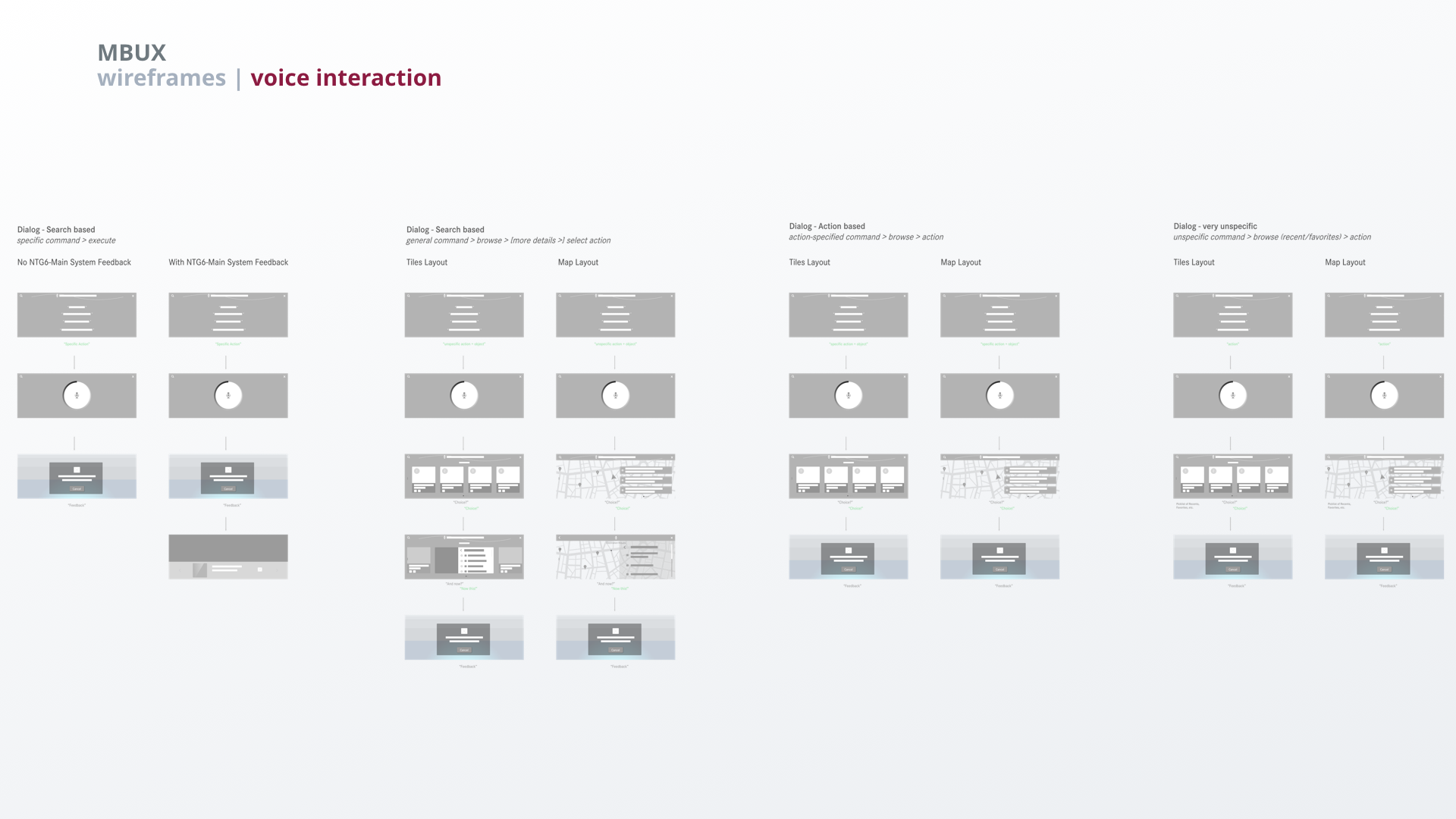
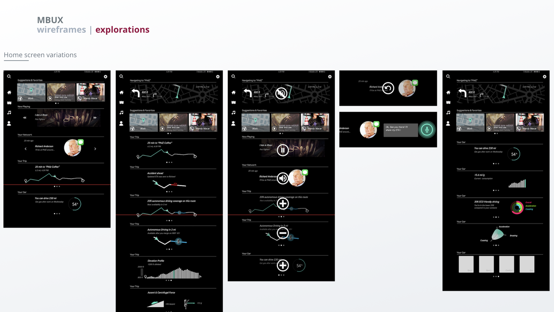
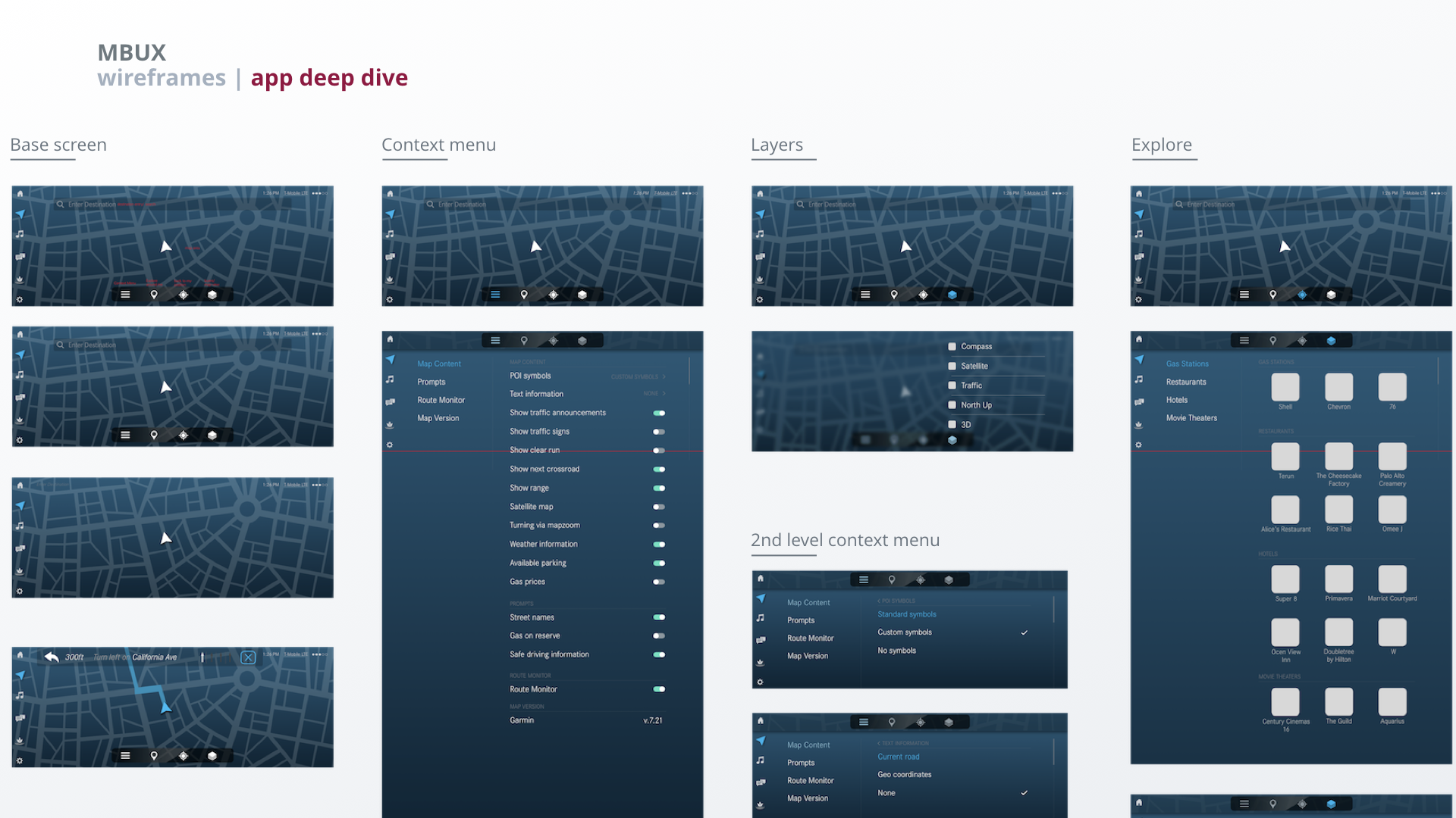
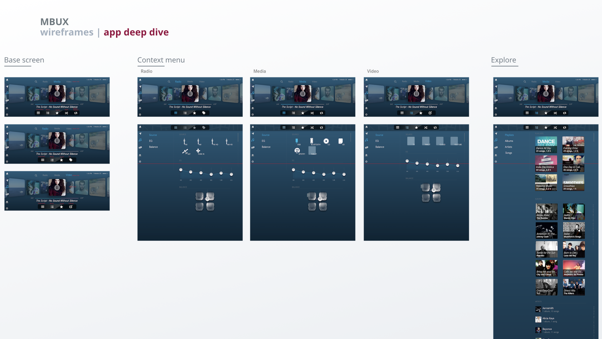
Wireframes
For our proof of concept we focused on establishing a clear conceptual model and interaction model. We explored multiple variants to find a solution that would work across all apps. We did a deep dive on two apps to illustrate the conceptual model, hierarchy and interaction.
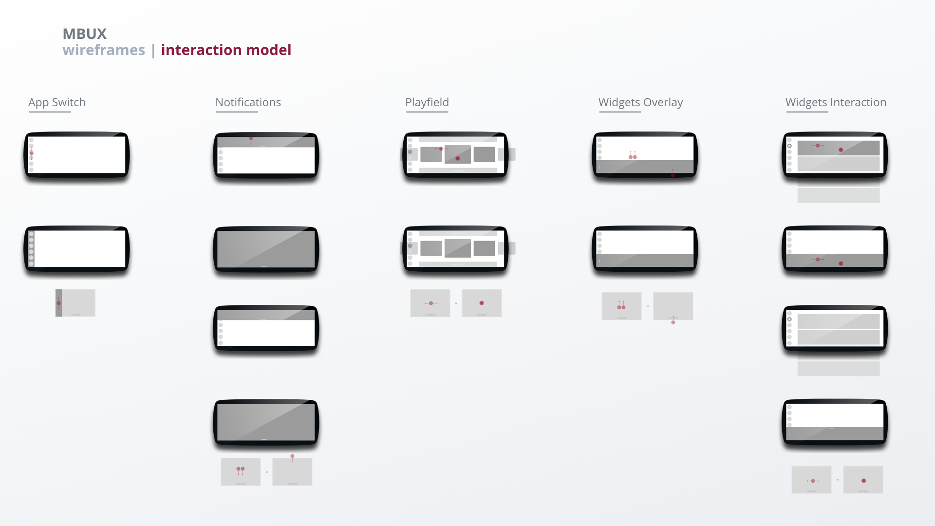
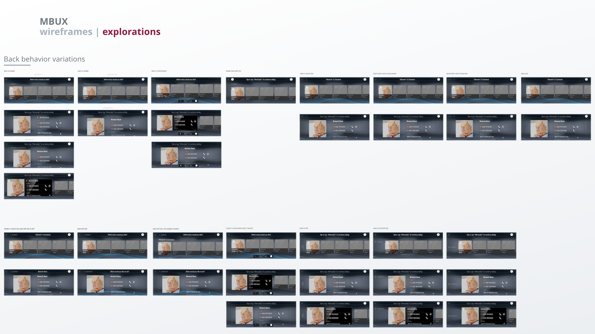

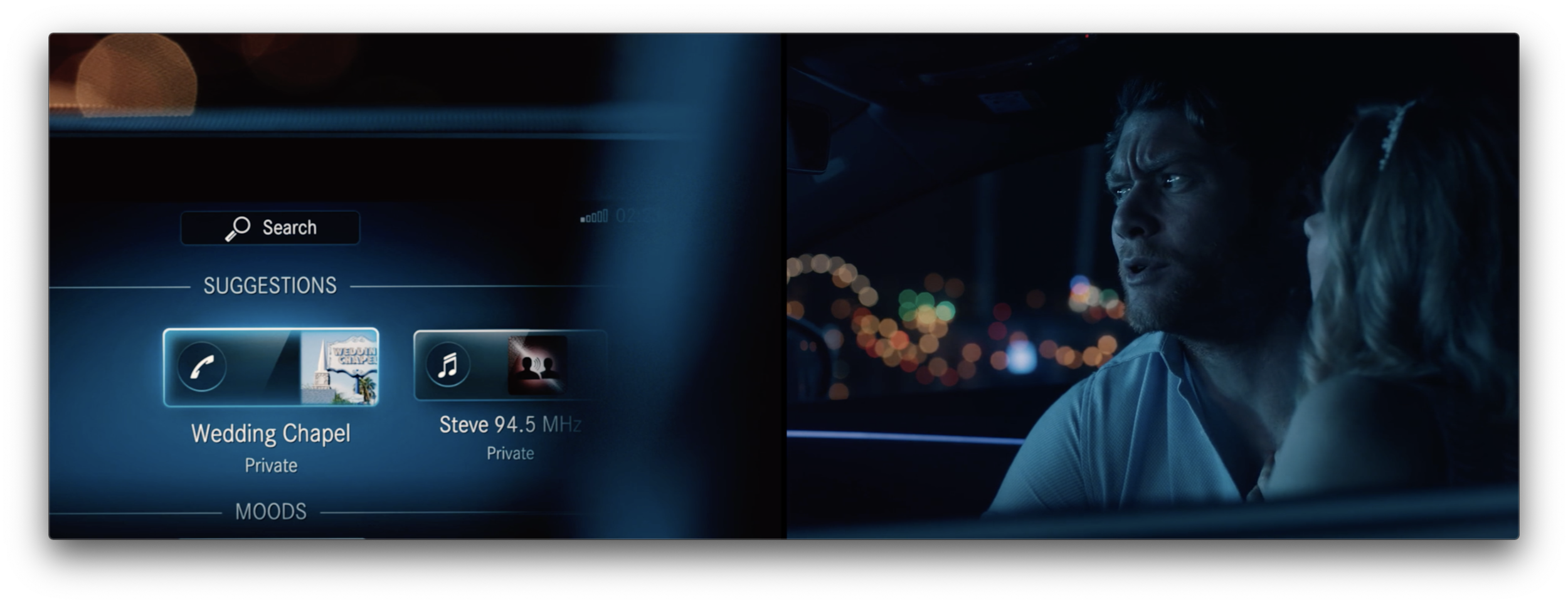
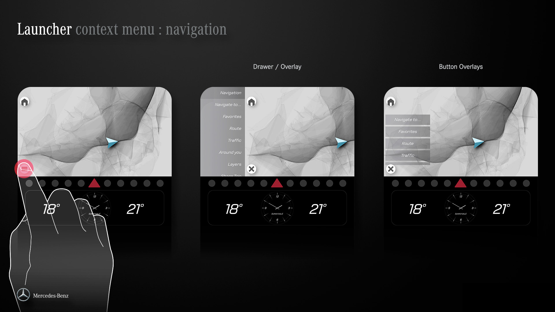
Decision point. Research revealed that the dock is hard to reach on the left edge of the screen because of the position of the steering wheel and the screen. Therefore, we had to modify the concept and move the app launcher to the home screen. It also became clear that we had to do adjustments to the control bar: it wasn't clear enough which controls take the user to a sub level and which control the playfield. We addressed this by placing controls leading to sub levels outside of the control panel.

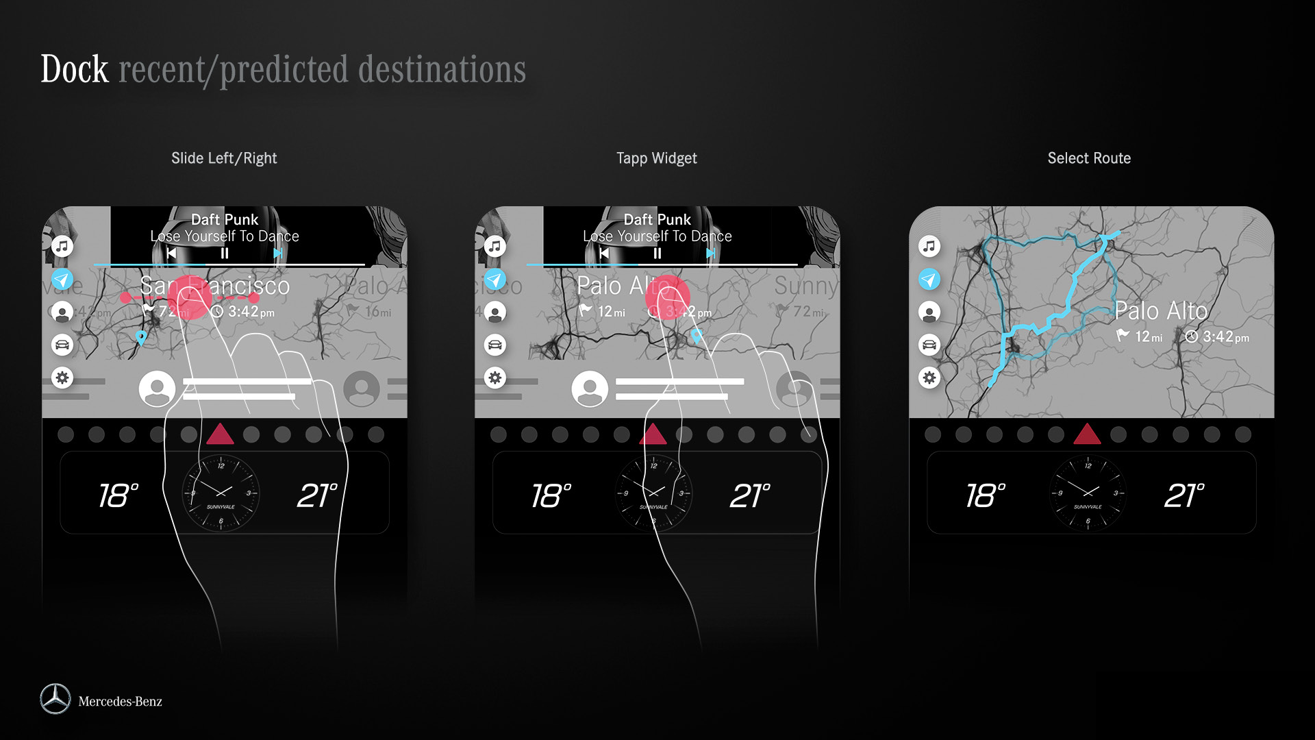
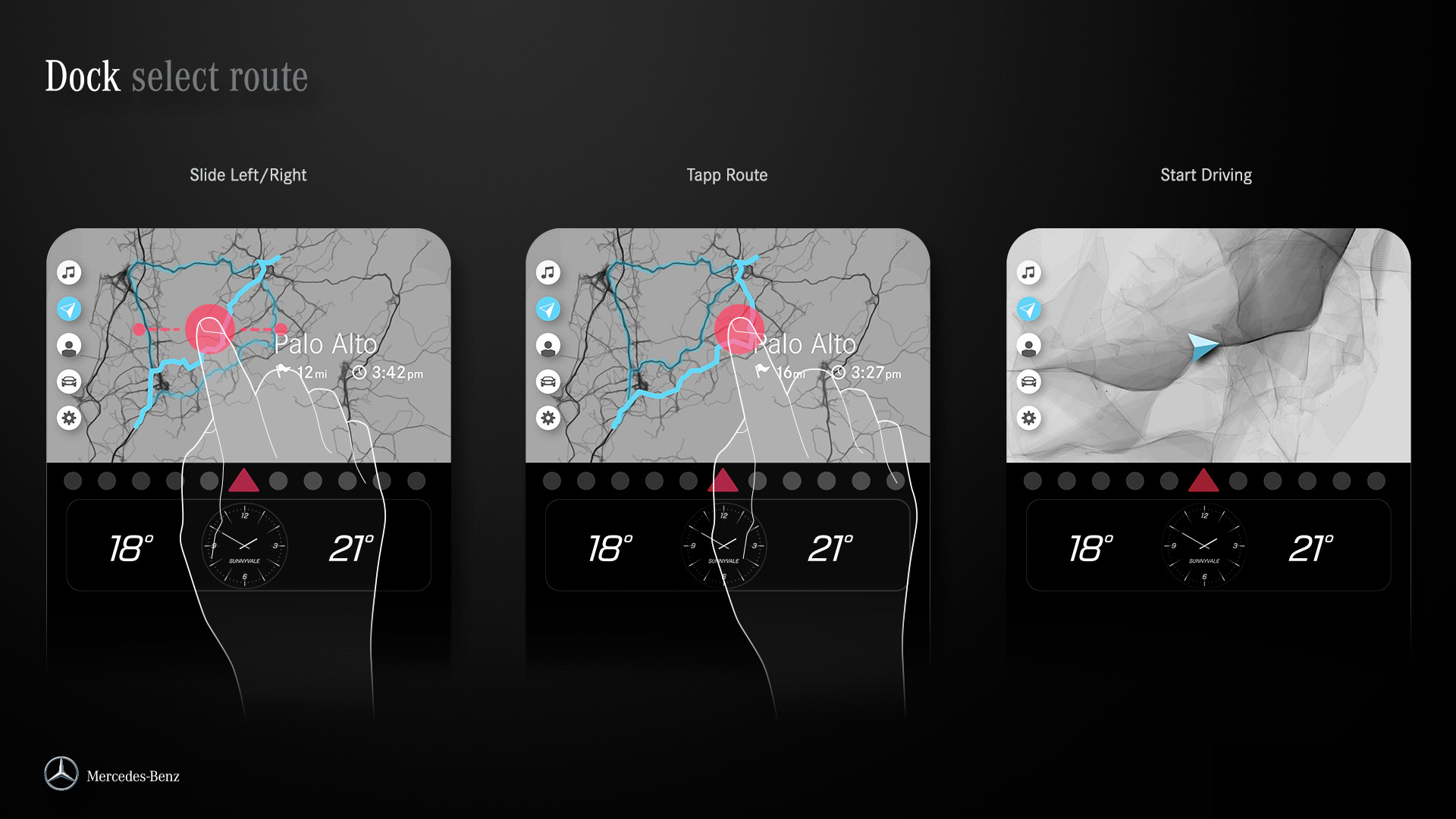
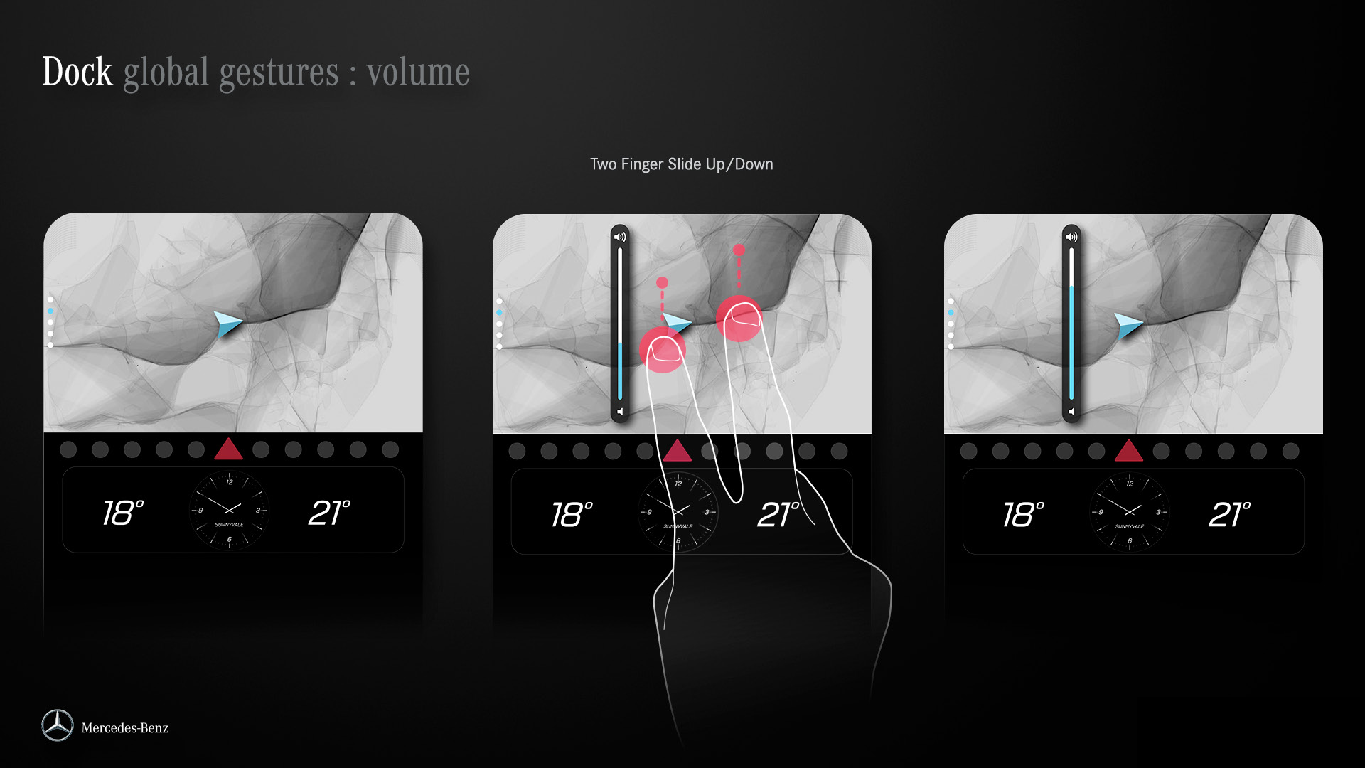
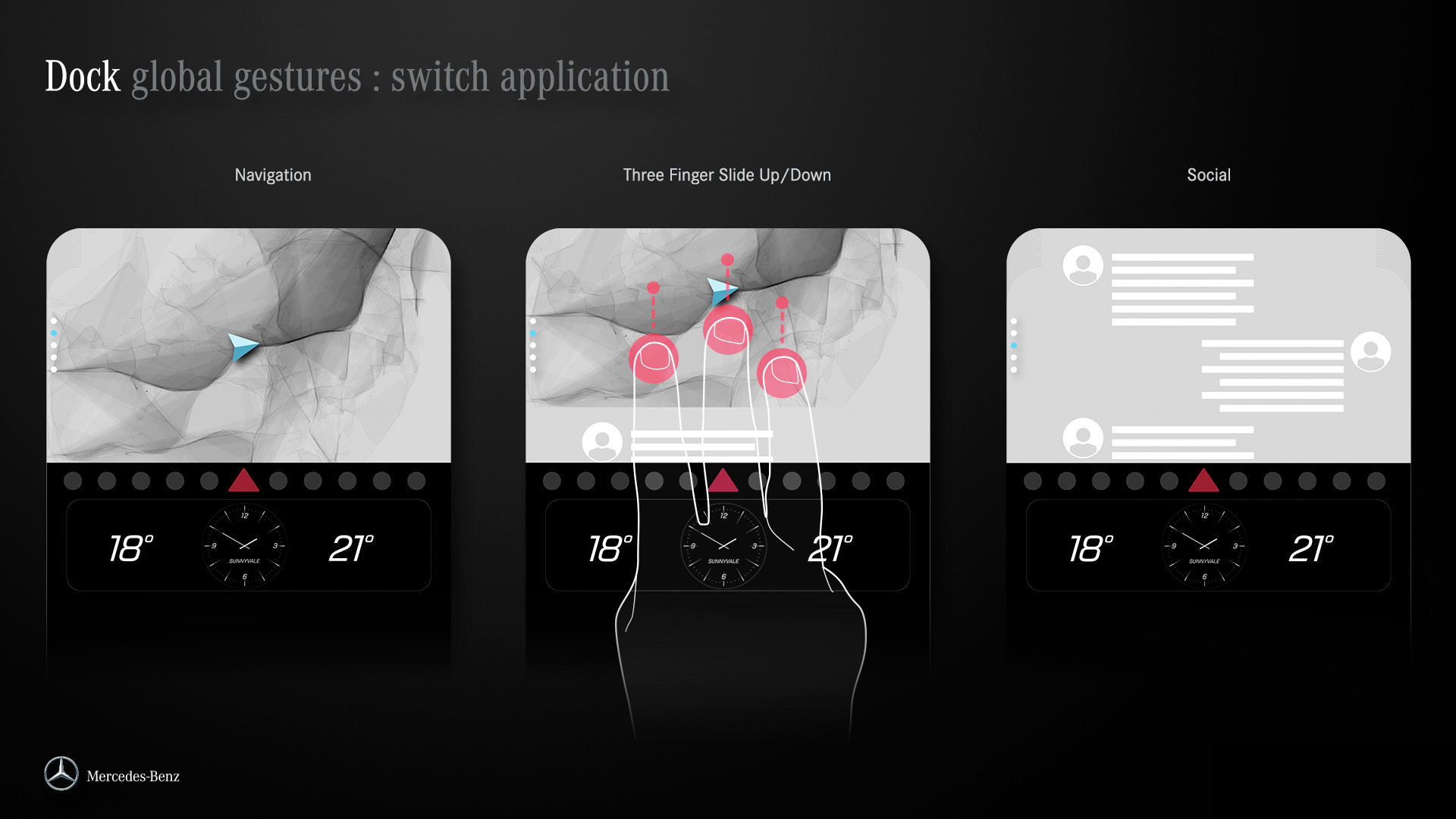
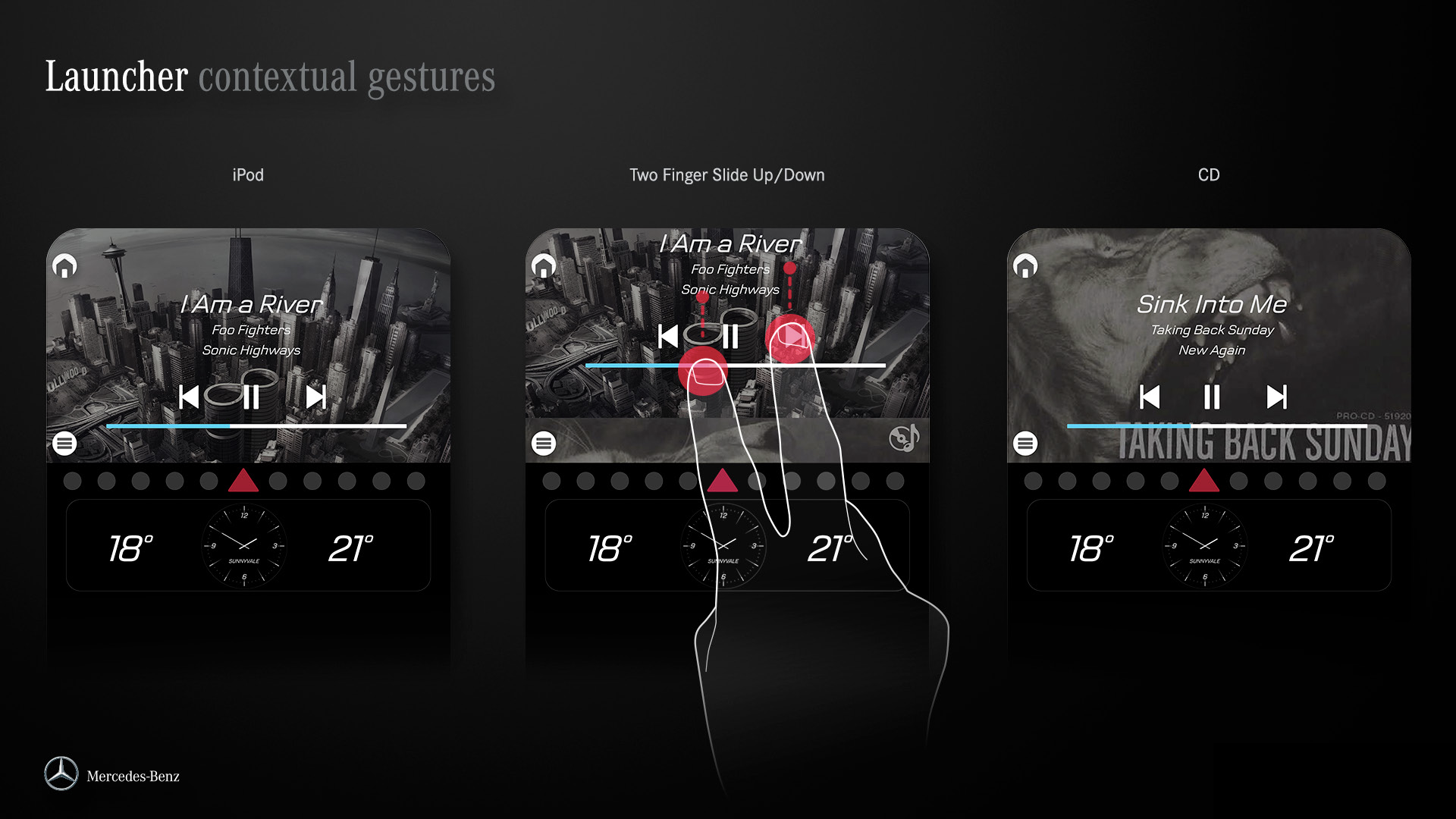
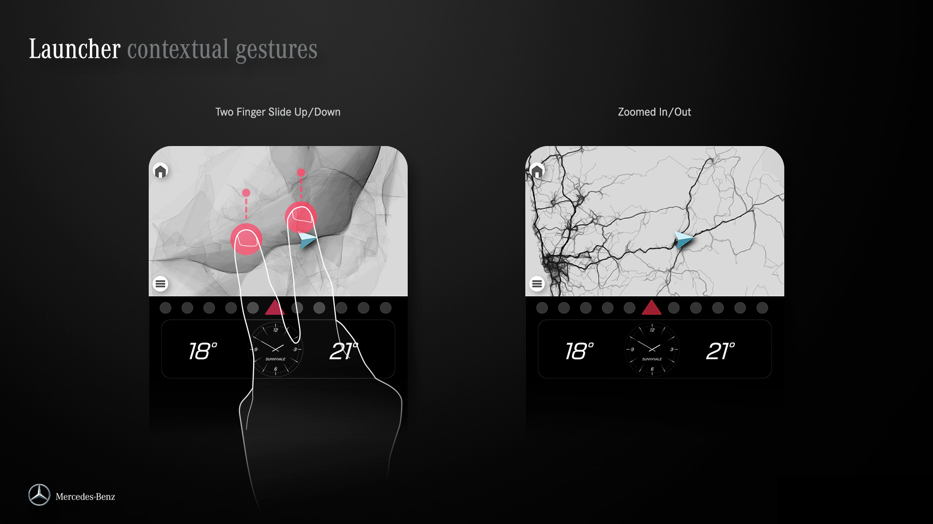
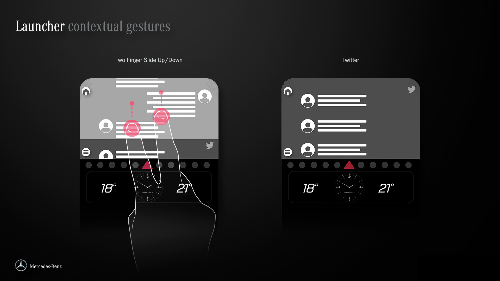
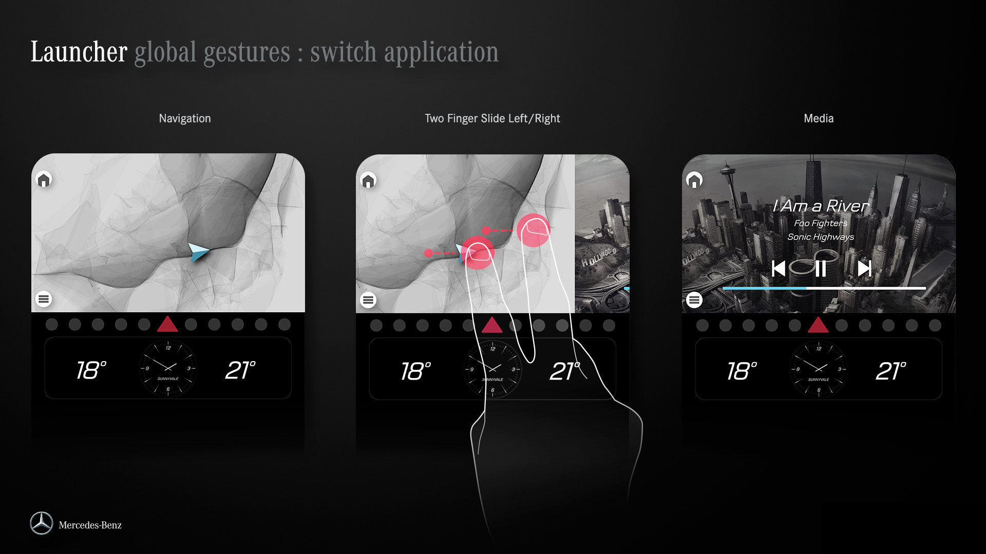
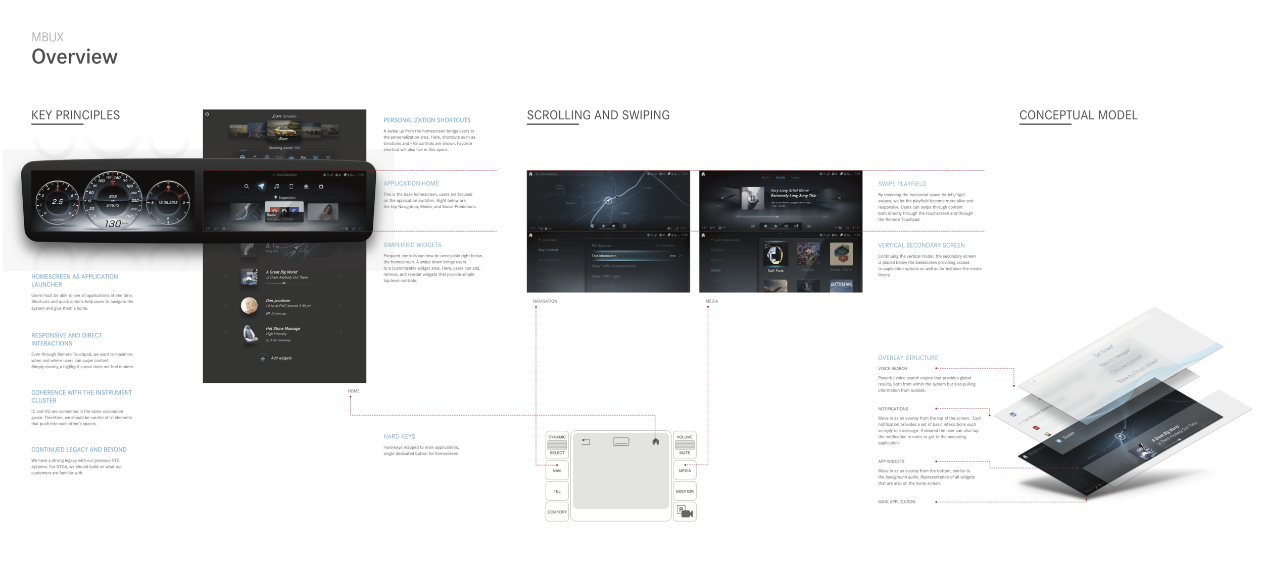
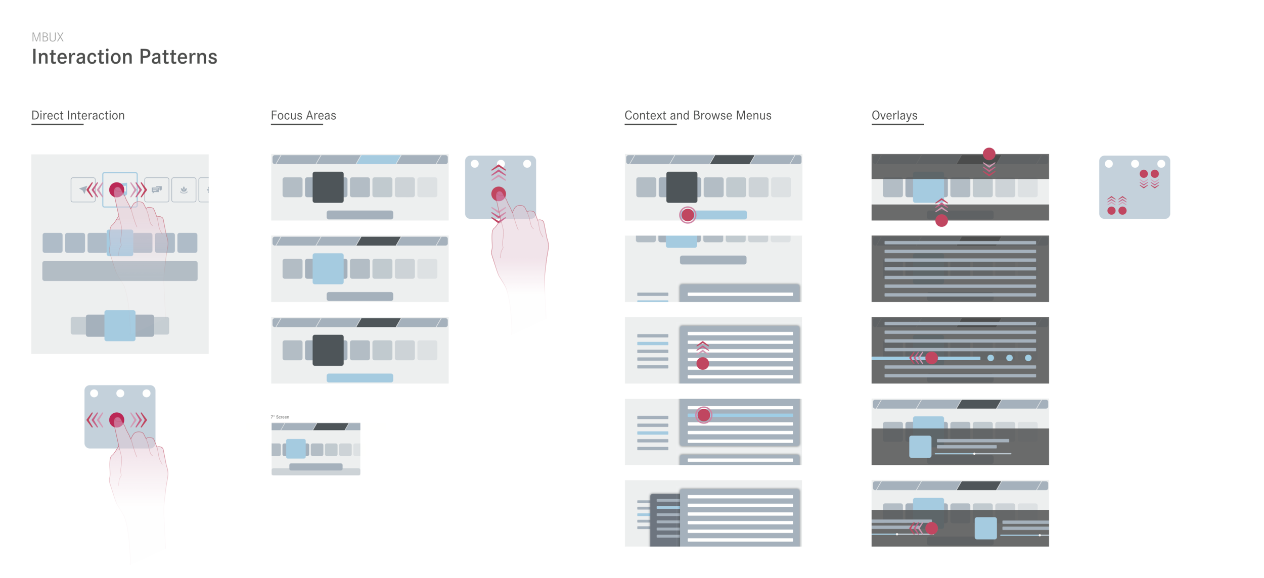
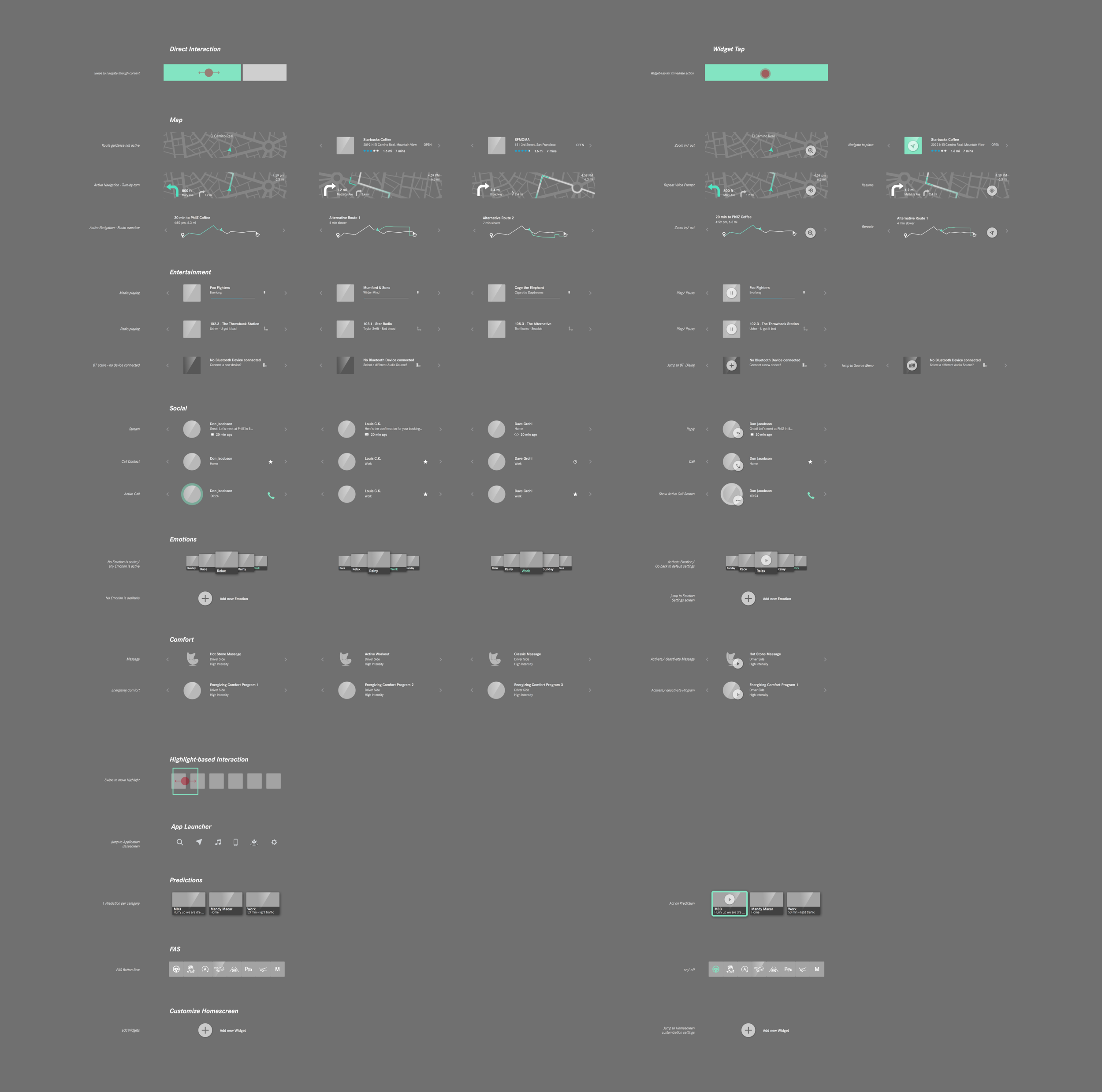
Principles & Patterns
The below overview highlights the key principles that we developed in order to ensure a simple and delightful
user experience.

Prototype
The best way to explain a concept is when a person can experience it. Fortunately, we were lucky enough to have a great creative technologist working with us who was able to prototype even smallest nuances in animations and behavior. Below is a video of the resulting prototype.
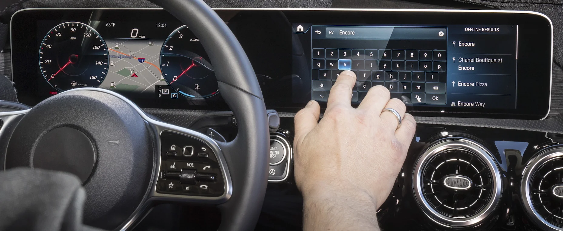
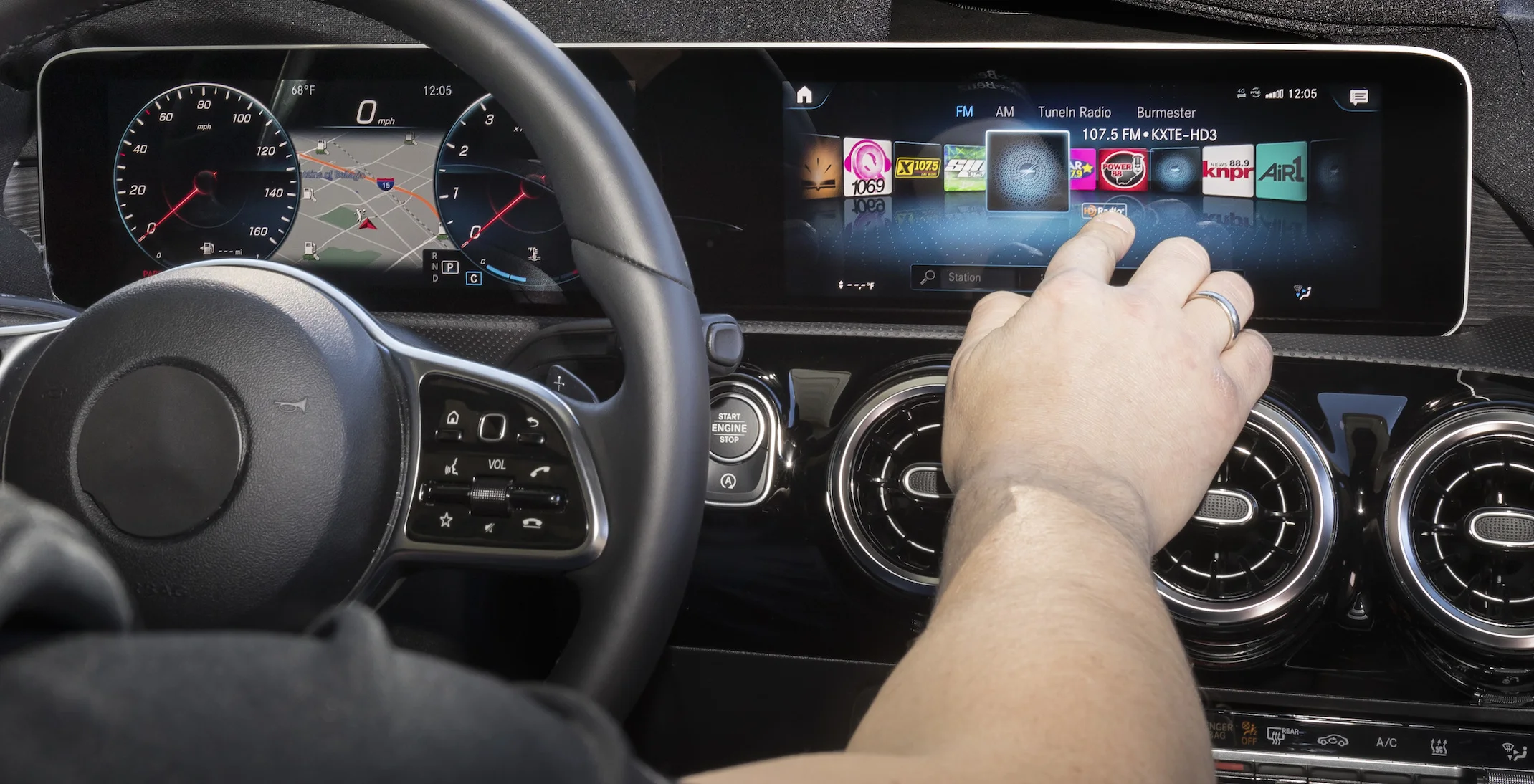
In the video you can see two forms of interaction: input via a touchpad and direct interaction with the touchscreen. In order to not cover the screen with my hand I mostly used the touchpad in this video.
Product
The end result is the product of two further years of development in Germany and in our studio in Sunnyvale – with us focusing on the voice assistant, suggestions and 3D real time rendering. Watch the walkthrough with Sajjad Khan, Vice President Digital Vehicle & Mobility at Mercedes-Benz.